|
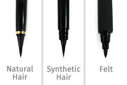
By: Lady T Powers & JetPens 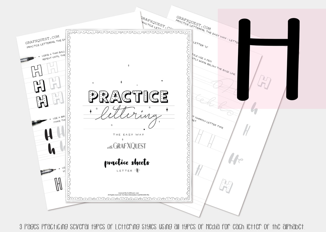 Now For the letter H Many posts ago we started you out with some practice sheets so you can start getting the feel of playing with lettering. You will also be able to print those sheets out as many times as you like to have extra space to practice the above lesson. You can get them here: Practice Sheets. You can also see the previous posts you missed starting with the Letter A here : Lesson A Get the rest of the letter lesson print outs here: Letter printouts. Want to share these with someone else? We ask that you do not share our files, instead share our link above to this post. Thanks. Be sure to read all previous lesson posts for letters as it will have some important hints to help you along with the rest of these lessons. Lets Move on to to the letter H. Following the instructions laid out in our previous posts be sure to print out your letter H files to follow along. The Letter H Lesson will be available free until May 13th 2019, at which point it will then become a $1 to help support the site. Hurry get it now. All lessons in this blog are for letter formation and tips for learning Hand lettering and may apply indirectly towards the kit you are working on. However these lessons should assist in most if not all cases in developing your lettering skills with these lessons. We will assume you now have read the posts on the letters plus have printed out your H files and practice sheets, and are ready to work! Today we are going to talk about the best pointed pen calligraphy supplies for beginners. 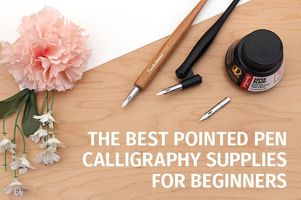 If you frequent social media chances are you’ve seen how beautiful calligraphy can be. You may have even watched some videos, or seen books on it at the supermarket check out. If you’ve ever wanted to learn calligraphy yourself, this article is for you. We will go over some of the basic calligraphy tools you’ll need to get started and show you how to use them. There are several ways to make calligraphy, but we will focus on pointed pen calligraphy. This uses a pen with a pointed tip which makes both thick and thin lines by flexing, or bending open, as you press it onto the paper. CALLIGRAPHY SUPPLIES FOR BEGINNERS. Most pointed pen calligraphy is done with dip pens, which consist of a metal nib, or tip, which is attached to a handle called a nib holder. Dip pens do not hold ink; instead, you dip them into a container of ink, or use watercolors, acrylic paint and more as you write. I like using the DR. PH Martin's and lately I have been looking into creating my own watercolor dip inks...sorry I regress. Anyway, pointed metal nibs for dip ink are typically more flexible than fountain pens, which allows them to achieve greater line variation. They are also able to handle more kinds of ink, since they have no inner workings to clog or corrode. To get started, you will need:
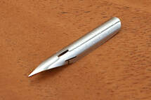 Lets look at the Nikko G Nib Its relative firmness makes it easier to manage than most nibs but it still produces nice thin lines and is capable of a satisfying amount of flex to make thicker lines. I know what you are thinking...this pointy nib can make wide strokes? YES! 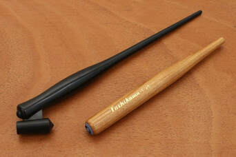 NIB Holders Nib holders come in two styles: straight and oblique. Straight nib holders are better for upright calligraphy styles and oblique nib holders make it easier to work with more slanted styles. The Speedball Oblique Pen Nib Holder, ( I personally use this one) is a solid, reasonably priced starter oblique pen holder and the straight Tachikawa Comic Pen Nib Holder for Various Pen Nib - Model 25 is a good choice because it secures nibs more firmly than some other inexpensive holders. I prefer to switch between them depending on what style of calligraphy I am working with. Experiment with both to find your preference. Paper We have discussed paper types in the past articles to assist you in the choice for all types of hand lettering. However let's touch on it briefly for using dip pens. Ordinary printer paper is not suitable for calligraphy because it is too rough. The nib is likely to catch on the rough paper fibers, causing frustrating ink splatters. Printer paper is also more absorbent, which encourages the ink to spread out along the paper’s fibers. This is called “feathering” and prevents the smooth lines calligraphers aim for. To make your practice as enjoyable and effective as possible, use paper that is suitable for fountain pens. I recommend Rhodia. It is a high quality, smooth paper that is available lined, blank, or with a dot grid. Parchment paper is also a good choice. and can give your project a vintage flair. Ink type for beginning Dip pens can handle many kinds of ink and I mentioned some above, but all you need to start out is a good, black ink. I personally recommend Speedball Super Black India Ink. It is reasonably priced, waterproof, and very dark, so your calligraphy will look crisp and clear. I started out with this ink in my high school art classes. I use this ink for illustration and water coloring as well due to it's waterproof capabilities. Note: laying it on thick can leave it open for smudging, ensure it is completely dry before using watercolor methods. 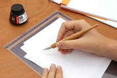 Find a place to write A pleasant workspace with all of your supplies conveniently placed allows you to relax and focus during your calligraphy practice. Choose a place where you can sit comfortably with your feet flat on the floor. It should be clean and uncluttered so that your arm can move freely. Place a writing board or five to six sheets of scrap paper under the paper you will be writing on. A soft surface like this lets you write more smoothly and naturally than a hard tabletop. It’s better to write on loose sheets of paper because a notepad would prevent your hand from lying flat and interfere with its movement. 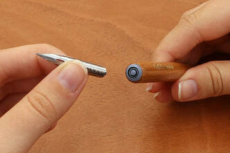 Set up your tools Place a cup of water and a non-linty towel nearby to periodically clean your nib. You can use a paper towel, but fibers may snag on your nib and cause ink splatters. I tend to wet my paper towel to avoid this, or I use an eye glass cleaning micro cloth and lightly dampen it. If the mouth of your ink bottle is too narrow to dip your nib without touching the sides, pour some ink into a wide-mouth jar to give yourself more space. Save small jelly or spice jars for this purpose. It’s easy to spill both your ink and water, so find a spot where you won’t knock them over. If there is a mess to be made, I have done it! Make sure they are still within easy reach, though - you will be using them a lot. A good place might be above your paper. You can also place them inside a tape roll or tape them down for added security, this is what I do. Finally, install your nib in your nib holder. Grasp your nib near the base and push it into the outer ring on the end of your nib holder. Try not to grab the nib by the tip, as you could bend it out of shape.
Dipping your pen To get started, dip your nib into the ink until it covers the hole on the nib’s back, called the “breather hole.” Wipe any excess off on the sides of the bottle and you’re ready to write.
Once you have gotten the hang of these basic strokes, use them to make letters. Write the alphabet, your name, or anything you like. Imitate scripts you admire and use printable practice sheets for more guidance. Just be sure to print them on suggested papers to avoid splatters. 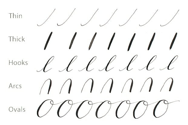 Next time we will continue this post with advanced strokes and equipment. We will also be presenting you with the letter I "i" practice kit for free!
Will you Share your work with us? We would love to feature you. Contact us with what you have done so far and submit your images to us as well as any tips or hints you have found so far in your journey with us. We would love to share to help everyone! I hope I have given you some additional insight into developing your hand-lettering skills and are enjoying your journey with me. Have fun working with the Letter H practice sheets. I highly suggest printing them on to HP Printer Paper, Premium 32 especially to practice what we talked about above. Until next time, "I" will be seeing you! lol Need Additional Space to practice? Don't forget your calligraphy practice sheets, now featuring an extra bonus, that track the pen type you use and has six brackets set up for practicing whole lines or single letters. See you next time! Thanks! ~ Lady T
0 Comments
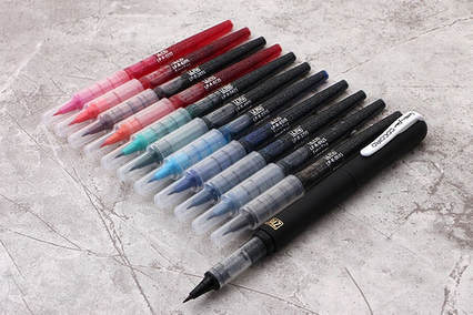
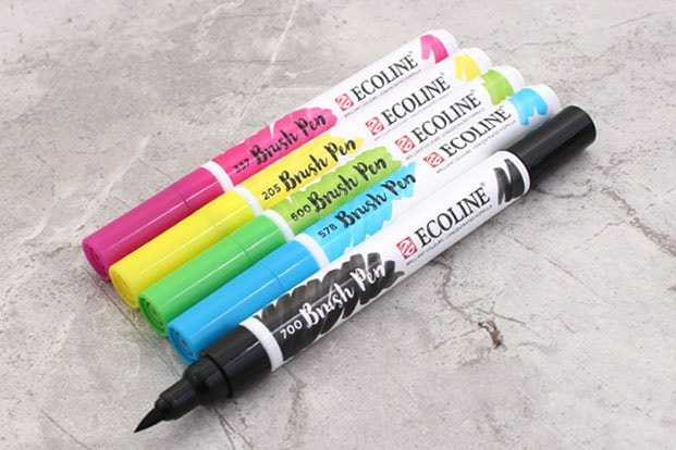
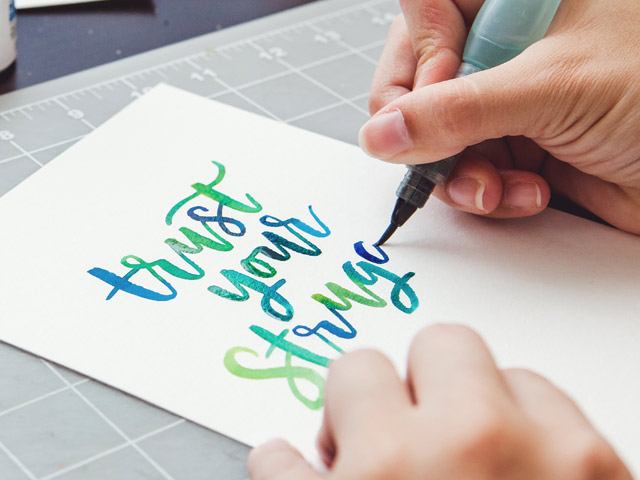
By: Lady T Powers & JetPens 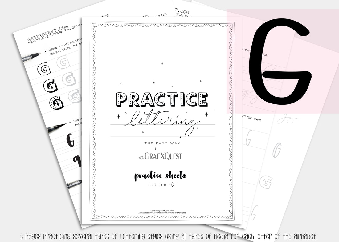 Now For the letter G Several posts ago we started you out with some practice sheets so you can start getting the feel of playing with lettering. You will also be able to print those sheets out as many times as you like to have extra space to practice the above lesson. You can get them here: Practice Sheets. You can also see the previous posts you missed starting with the Letter A here : Lesson A Get the print outs here: Letter A Printouts , Letter B Printouts , Letter C , letter D, letter E and letter F Printouts! Want to share these with someone else? We ask that you do not share our files, instead share our link above to this post. Thanks. Be sure to read the first post for letter A as it will have some important hints to help you along with the rest of these lessons. Lets Move on to to the letter F. Following the instructions laid out in our last posts on the letters A, B, C, D, E and F be sure to print out your letter G files to follow along. The Letter G Lesson will be available free until March 26th 2019, at which point it will then become a $1 to help support the site. Hurry get it now. All lessons in this blog are for letter formation and tips for learning Hand lettering and may apply indirectly towards the kit you are working on. However these lessons should assist in most if not all cases in developing your lettering skills with these lessons. We will assume you now have read the posts on the letters A,B,C,D, E and F plus have printed out your G files and practice sheets, and are ready to work! Today we are going to talk about best brush pens for lettering and calligraphy. PART 2 Beginners Dramatic Lettering & tools to try Let me first start by saying, that by no means should you rush out to buy these supplies. You can always use what you have on hand. But it's always good to be exposed to different methods. We’ve all seen beautiful lettering with extra crisp hairlines and whimsical twirls. In this case it is helpful to have tools that can make this easier. For dramatic lettering, the brush pen tip should be soft and elastic so that you get more stroke variation. Pigmentation is also another consideration. We will look at both today. I do recommend using a dark black ink to convey your message boldly. Additionally, seek out brush pens with archival ink—you want your beautiful lettering to last! Without archival ink over time your lettering may fade. 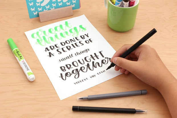 The Royal Talens Ecoline Watercolor Brush Pens (Below) and Uni Brush Pen Set are great for dramatic lettering.
Let's see this pen in action... WaterColor Calligraphy Pens
Let' see these pens work... Create shadows and 3D effects
next time...  Next time we will continue this post with additional tools for beginners. If you frequent social media or have been to a wedding, chances are you’ve seen how beautiful calligraphy can be. If you’ve ever wanted to learn calligraphy yourself, this article is for you. We will go over some of the basic calligraphy tools you’ll need to get started and show you how to use them. We will also be presenting you with the letter H practice kit for free!
Will you Share your work with us? We would love to feature you. Contact us with what you have done so far and submit your images to us as well as any tips or hints you have found so far in your journey with us. We would love to share to help everyone! We hope we have given you some additional insight into developing your hand-lettering. Have fun working with the Letter G practice sheets. I highly suggest printing them on to HP Printer Paper, Premium 32. Now that you have some insights on pens and why, (hints on practice sheets too) begin following the directions on your G Sheets. The entire alphabet will soon be ready to purchase as a complete set. Until then Hhhh...eck it was good seeing you! Need Additional Space to practice? Don't forget your calligraphy practice sheets, now featuring an extra bonus, that track the pen type you use and has six brackets set up for practicing whole lines or single letters. See you next time! Thanks! ~ Lady T By: Lady T Powers & JetPens  Now For the letter F Several posts ago we started you out with some practice sheets so you can start getting the feel of playing with lettering. You will also be able to print those sheets out as many times as you like to have extra space to practice the above lesson. You can get them here: Practice Sheets. You can also see the previous posts you missed starting with the Letter A here : Lesson A Get the print outs here: Letter A Printouts , Letter B Printouts , Letter C , letter D, and letter E Printouts! Want to share these with someone else? We ask that you do not share our files, instead share our link above to this post. Thanks. Be sure to read the first post for letter A as it will have some important hints to help you along with the rest of these lessons. Lets Move on to to the letter F. Following the instructions laid out in our last posts on the letter A, B, C,D and E be sure to print out your letter F files to follow along. The Letter F Lesson will be available free until October 26th 2018, at which point it will then become a $1 to help support the site. All lessons in this blog are for letter formation and tips for learning Hand lettering and may apply indirectly towards the kit you are working on. However these lessons should assist in most if not all cases in developing your lettering skills with these lessons. We will assume you now have read the posts on the letters A,B,C,D and E plus have printed out your F files and practice sheets, and are ready to work! Today we are going to talk about best brush pens for lettering and calligraphy. PART1 Beginners 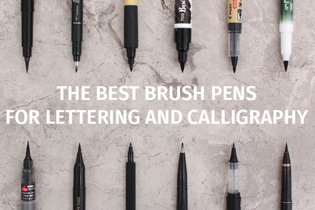 It takes practice and control to use a brush pen, but you don't have to be a serious artist or calligrapher to create beautiful script. There are many different types of brush pens to choose from and I've compiled a guide to help you find some of the best brush pen for calligraphy. Read on to see our top recommendations for brush pens that suit beginners, dramatic lettering, and Asian calligraphy.
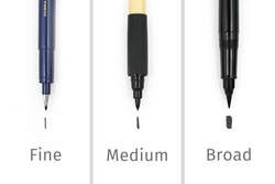
Beginners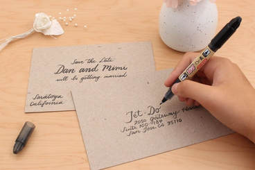 Most people are familiar with the feel of a firm felt-tip marker and intuitively know how to control them. Good brush pens for beginners are more marker-like than brush-like. If you’re a beginner, try brush pens with firm tips for easy control and predictable strokes. With some practice, you too can create the beautiful lettering featured on social media.
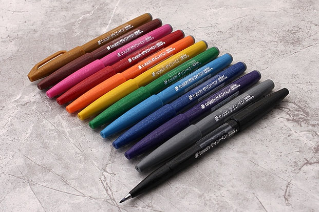
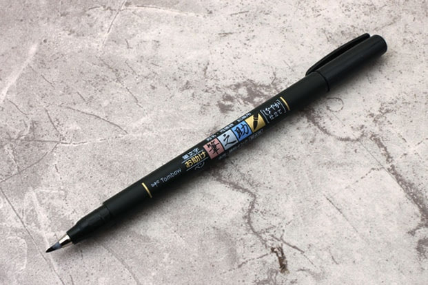
 In Japanese, “Kokoro” means heart and “iro” means color. This is the CocoIro which was specially created for customizing your pen to match your heart and mind. You have plenty of color options for building a pen that’s truly your own, from the pen bodies to the ink refills. the refills come in 11 colors. The CocoIro’s extra fine tip is flexible, but also firm enough that it’s easy for newbies to create thin, elegant letters. Available in 11 different colors, the ink is water based and water soluble. The separately sold bodies have streamlined bullet shapes and soft surfaces. To assemble a CocoIro pen, remove the transparent cap from the refill and insert the nib into the pen body. Screw the threads of the refill and that of the pen body together firmly. 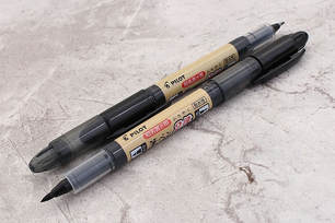 Our last and second favorite choice for beginners is the Pilot Futayaku which means "two uses" in Japanese. This double-sided pen has two hard felt tips, one medium and one fine. Both tips will create seamlessly tapered lines with the right amount of pressure. The medium tip is softer and more flexible than its fine counterpart. The pen’s ink delivery is constant and juicy. The ink itself is a satisfying opaque black color. It offers some water resistance but isn’t entirely waterproof. Also, keep in mind that its 30-second ink drying time is slower than some of the brush pens mentioned in this guide. Next time we will continue this post with Dramatic Lettering for beginners and the letter G. Will you Share your work with us? We would love to feature you. Contact us with what you have done so far and submit your images to us as well as any tips or hints you have found so far in your journey with us.
We hope we have given you some additional insight into developing your hand-lettering. Have fun working with the Letter F practice sheets. I highly suggest printing them on to HP Printer Paper, Premium 32. Now that you have the right pens (hints on practice sheets too) begin following the directions on your F Sheets. The entire alphabet will soon be ready to purchase as a complete set. Until then G it was good seeing you! Need Additional Space to practice? Don't forget your calligraphy practice sheets, that track the pen type you use and has six brackets set up for practicing whole lines or single letters. See you next time! Thanks! ~ Lady T By: Lady T Powers Now For the letter E Catch up time! Haven't started the Lettering classes yet? For this week only catch up for free and download letters A-E for free. Read on to find out how! Several posts ago we started you out with some practice sheets so you can start getting the feel of playing with lettering. You will also be able to print those sheets out as many times as you like to have extra space to practice the above lesson. You can get them here: Practice Sheets. You can also see the previous posts you missed starting with the Letter A here : Lesson A Get the print outs here: Letter A Printouts , Letter B Printouts , Letter C Printouts, letter D Printouts and now letter E Printouts! Want to share these with someone else? We ask that you do not share our files, instead share our link above to this post. Thanks. Be sure to read the first post for letter A as it will have some important hints to help you along with these lessons. Lets Move on to to the letter E. Following the instructions laid out in our last posts on the letter A, B, C and D be sure to print out your letter E files to follow along. The Letter E Lesson will be available free until October 19th 2018, at which point it will then become a $1 to help support the site. For a limited time get kits A-E for free until October 19th 2018. Add them all to your basket and then use code CATCHUPletters at check out to get them free. All lessons in this blog are for letter formation and tips for learning Hand lettering and may not always apply directly towards the kit you are working on. However most of these lessons should assist in most if not all cases in developing your lettering skills. We will assume you now have read the posts on the letters A,B,C and D plus have printed out your E files and practice sheets, and are ready to work! Today we are going to talk about paper types when lettering.
Here are the categories we will cover:
This is based on personal experiences and there will always be better options out there, if you found something better out there please comment below to share with others! The difference between papersThe first noticeable difference in papers is made by touching them. Some of them are smooth to the touch and others are rougher, and on top of that on some papers you can spot the grain difference just by looking at them, or holding them up to the light. Depending on the lettering tool you wish to use you will pick a certain type of paper, however, we will talk more about it in a few moments.
Another benefit from using smooth, bleedproof paper is that you are preventing fraying of the brush tip. 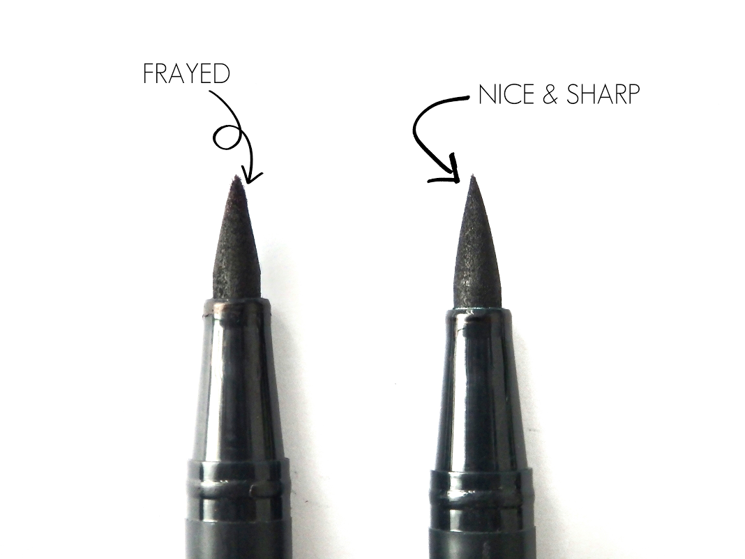 Fraying causes the brush pen to lose the original elasticity which makes the transition between thick and thin much more challenging. Regular copy paper has longer and more coarse fibers which are literally tearing apart your brush tips with every single stroke that you are making. Using bleedproof paper, the ink from the brush pen will not spread on the paper which will keep your lettering nice and crisp. Remember that these benefits are mostly related to felt tip brush pens. Best papers for calligraphyNow let's talk about some of the best papers for calligraphy. I will also mention some of the most popular calligraphy tools and what paper is most suitable for that specific tool. Brush pens (felt tips) – as we already mentioned at the beginning, the best paper for your brush pens is smooth, bleedproof (non-absorbent) paper. Here are a few different brands that you simply can’t go wrong with :
Here are a few recommendations for watercolor paper for hand lettering:
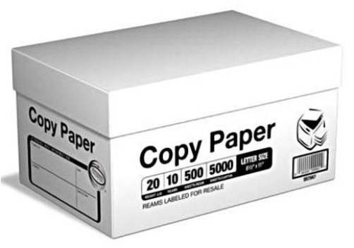
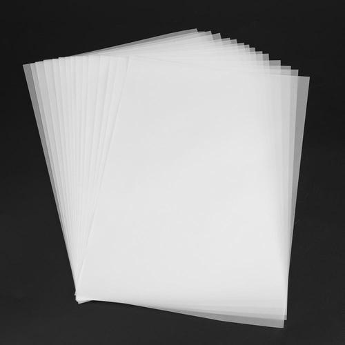 Best paper for hand lettering.You may or may not know, but hand lettering and calligraphy are two different things. Calligraphy is the art of beautiful writing while hand lettering is the art of illustrating letters (drawing each shape separately). Essentially this means that for hand lettering you mostly use different tools compared with calligraphy. Another great investment for your hand lettering when we talk about paper is tracing paper. The great thing about tracing paper is that it works wonders in combination with a light tablet – you can literally endlessly refine your piece, or at least until you are satisfied with it, just a like layers in Adobe Photoshop. 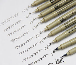 The most essential tool for hand lettering is a pencil, and alongwith the pencil an inking tool is used such as the Sakura Pigma Micron pens. In that case you can even use regular copy paper as it wont damage your tools.
Now that you know more about which paper to choose be sure to find the right pens for your lettering style by practicing and using the correct papers to save your investments! Share your work with us? We would love to feature you. Contact us with what you have done so far and submit your images to us as well as any tips or hints you have found so far in your journey with us. Join us again soon for the Letter F. We hope we have given you some additional insight into hand-lettering. Have fun working with the Letter E practice sheets. I highly suggest printing them on to HP Printer Paper, Premium 32. Now begin following the directions on your E Sheets. The entire alphabet will soon be ready to purchase as a complete set. Until then F you next time! 😲 Need Additional Space to practice? Don't forget your calligraphy practice sheets that track the pen type you use and has six brackets set up for practicing whole lines or single letters. See you next time! Thanks! ~ Lady T Author: Lady T Powers 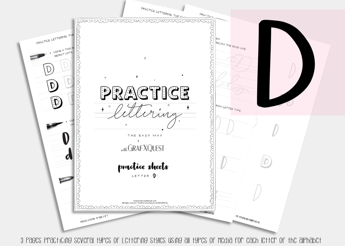 What comes next after C ? right... the letter d!  Several posts ago we started you out with some practice sheets so you can start getting the feel of playing with lettering. You will also be able to print those sheets out as many times as you like to have extra space to practice the above lesson. You can get them here: Practice Sheets. You can also see the post you missed on the Letter A here : Lesson A and get the print outs here: Letter A Printouts and Letter B Printouts and Letter C Printouts and now letter D Printouts. Want to share these with someone else? Please do not share our files, instead share our link above to this post. Thanks. Be sure to read the first post for letter A as it will have some important hints to help you along with these lessons. Lets Move on to to the letter D. Following the instructions laid out in our last 3 posts on the letter A, B, and C be sure to print out your letter D files to follow along. The Letter D Lesson will be available free until April 6th 2018, at which point it will then become a $1 to help support the site. All lessons in this blog are for letter formation and tips for learning Hand lettering and may not always apply towards the kit you are working on. However most of these lessons should assist in most if not all cases. Moving along we will assume you now have read the post on the letters A,B, and C and have printed out your D files and practice sheets, and are ready to work! Today we are going to talk about handlettering tools. 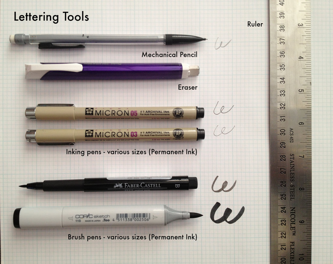 Hand Lettering styles are gorgeous and look so fluent and easy until you try them. All of a sudden you realize you are either good at them or well, just plain stink! However there is good news for you fellow stinkers, anyone can learn it – it just takes practice. I compiled some hand-lettering tips from HOW Design University‘s lettering extraordinaire, Denise Bosler, to help you with your lettering practice. First, you need the right tools, and we borrowed this practical tool guide from Denise Bosler’s Hand-Lettering Power Course. You can either use graph paper for handlettering or even better yet the practice sheets we prepared just for this. Whichever form you use this will help in building on your consistency which we discussed in our previous post with the letter C. Basic Hand-Lettering Tips: Lettering is not the same thing as handwriting. When you are lettering, you are actually drawing the form of the letters. Create a library of inspiration. Browse Pinterest and YouTube as lettering artists frequently publish their work on those sites. We recommend following Denise Boslers Pinterest boards as she always posts fantastic resources for inspiration. But the point is you need reference materials that you can copy or trace over to learn how to build fluidity and your own style. Look to typographic design for inspiration. Denise Bosler advises that “the best way to start [lettering] is by copying from existing typefaces to get to know the feel of the letterforms.” Trace known typefaces, such as Arial, using the grid paper. Pay close attention to the spacing, line heights and widths. Then practice practice practice. Our Letter D comes with several type faces to learn which are consistent with the rest of our alphabet. Try learning those first as there is lots to inspire you and space to learn. Remember to follow the rules of typography. (If you’re new to typography, here’s a handy list of typography terms. Refine, refine, refine. Once you have sketches of your lettering, refine until the letters follow the typographic rules. Refining might take several tries. This is why you need an eraser nearby as you’ll use it often. Always start with a pencil. Use several sheets until you have the perfection you desire before adding your ink. The tools above are merely suggestions and there are more types on the Practice sheets included. One thing I cannot stress enough is practice. With practice you CAN be just as good as the professionals and can use it for so many things. CARDS, TAGS, GIFTS, WEDDING ANNOUNCEMENTS, WALL ART, START YOUR OWN BUSINESS. If you ever had doubts that you can not do it? You are dead wrong. You can do anything your mind sets to if you are willing to put effort into it. Try some of the tools above. Pick up your free copy of letter D today while it lasts. Share your work with us? We would love to feature you. Contact us with what you have done so far and submit your images to us as well as any tips or hints you have found so far in your journey with us. Join us again soon for the Letter E. We hope we have given you some additional insight into hand-lettering. Have fun working with the Letter D. The entire alphabet will soon be ready to purchase as a complete set. Until then we will E you next time! Need Additional Space to practice? Don't forget your calligraphy practice sheets that track the pen type you use and has six brackets set up for practicing whole lines or single letters. See you next time! Thanks! ~ Lady T
|
About this page.
Life in general is an art and I will show you how to find the beauty in everything you see and do. Subscribe and receive a free weekly download and updates. Archives
May 2019
Categories
All
Are you able to donate a $1 through PayPal to help assist this artist in keeping this extensive site alive. It is all out of pocket and costs over $50 a month to finance. If you enjoy this site it would really help. Thanks in advance! |

 RSS Feed

|
|
©1996-2022 GrafXQuest LLC All Rights Reserved.
|
|