|
Hi friends! Glad you stopped by to check out this edition about choosing backgrounds for your designs. Below is an amazing background and texture package I picked up from DesignCuts for only $29. I am going to use some of it today to show you a few things you can do with it. I had a great time with this awesome bundle. If you find you are interested in it too get over there this second before it times out! It is available for only 8 more days. 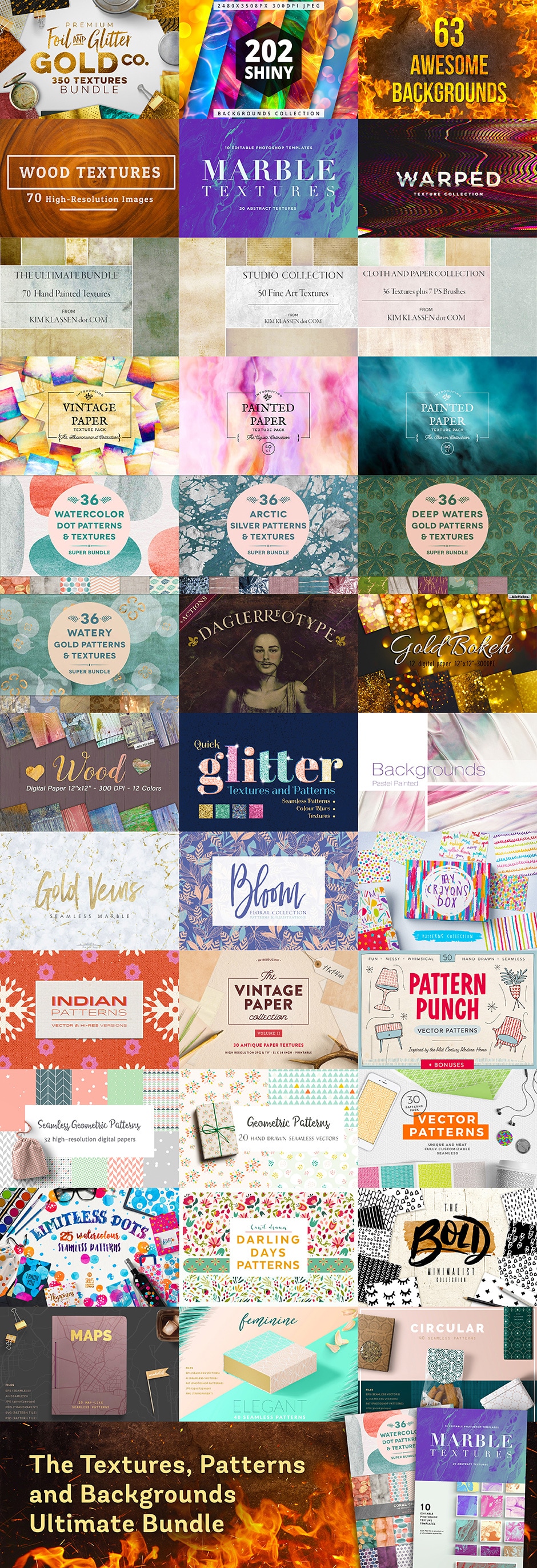 That's a lot to look at right? Yep and this bundle may help you a lot with answering the next question. So how do you go about choosing or creating a background image for your design, digital game, photographs, scrapbooks, cards, fabric, and pretty much anything else you can think of? Well its all about symmetry and using your gut instinct. It may also help to see what is up and coming and popular depending on the feel you are trying to achieve. For instance the most popular backgrounds right now are geometric, marble, faded or mute color, grunge (been in for a while). But are these right for you? Choosing a right background texture or pattern can totally set or break the mood of what you are trying to convey. So let us for an example say we are developing a website for deodorant. We could go a few ways to set the mood on our main page. We could try a grunge background texture behind our male model using one of the Kim Klassen samples above. What would that convey? Grunge could convey the dirty, stinky, route. By using a grunge texture for layers both over your model figure and behind in the background sets the mood to be used with the slogan; "Are you dirt nasty?" Try BoDOH! See left image below. 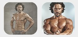 I used the same day photography images of actor Joe Manganiello (Sorry Joe) to prove that just changing a background can have a huge effect. On the left we were going for the grungy dirty look to "sell deodorant". On the right using a background from Hot Pixels, (Included in the bundle) we convey an entirely different feel. A more clean modern look that you might find on the front of GQ™ or Muscle Magazine™. Just by slightly dimming the actor by 90% on his layer in our Corel Photo Pro, gave us that more modern effect of muted/faded color and image without losing the clean feel. Now which one would you prefer to see on a deodorant website? And why? Again its about instinct and using your gut. What feeling are you trying to convey? What is YOUR message. Which one is going to sell your message? Here is another sample. Staff artist Angel Koch took images from the texture bundle to create a 9 page Planner sticker bundle. She was trying to convey a soft harmonious feel to this bundle. Did she succeed? 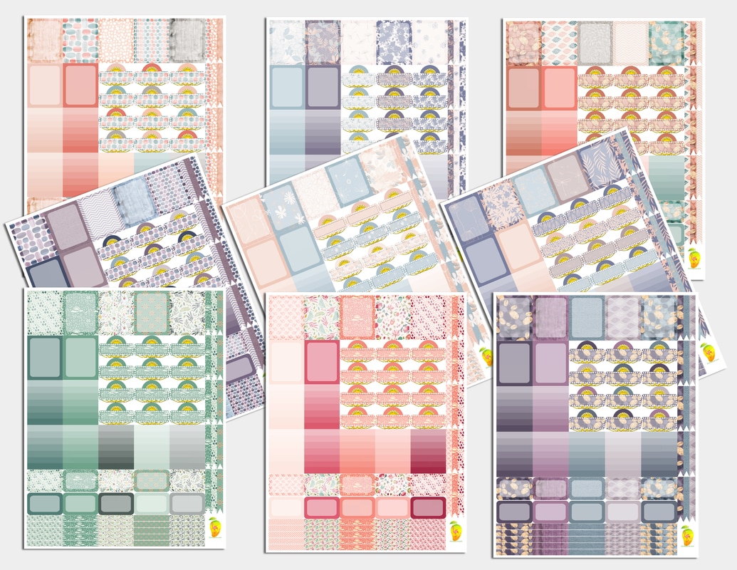 You can get this bundle at a discount here: PASSIONATE 9 Angel used the textures from the Bloom files included in the Texture Bundle. There are over a thousand images included in this texture bundle and she was able to create this set just using one small file of images. I personally love them. Here is what Angel had to say about it. Hi again GrafXQuest guests, it's Angel Koch again; President, Co Owner and designer of Flamango Door the Planner store here on GrafXQuest. I am back this week to play around with some graphics from DesignCuts. Once again there were really so many to choose from in the texture bundle that I had a hard time choosing what to start with! I decided to go with Bloom and I had plenty to work with! I created 9 planner sticker sets this time that I am very crazy about! I cannot choose a favorite. The patterns were super cohesive and I used matching solid colors for full boxes, half boxes, ombre boxes, headers, checklists, and movie marquees. I then printed them all out onto full sheet label stickers using my color inkjet printer at home, and kiss-cut them using an Xacto blade and a bit of patience. I put them in my own bullet journal using my go-to vertical layout reminiscent of Eric Condren and Happy Planner style. Here is my personal review of the graphics product above from DesignCuts: You get over a thousand of textures to play with for a tremendously good price! I was able to use the images without trouble, they easily fit into my Silhouette Studio program, no resizing or touching up at all, no converting to other file types, either. Working with them was a dream, and my planner stickers are beautiful! I would definitely recommend this bundle as I have enough to play with for months. The sale won't last long, though, so you'd better hurry! Thanks for your time -Angel Thanks so much Angel for playing with the bundle and giving us your valuable opinion. I also just created a freebie for our Newsletter followers, (below). Using the metallic rose gold patterns included in the package by Zepplin, I created a cute little stationary set. Unfortunately unless you are already signed up for our Newsletter you wont get this one as it has already launched; the one below is not full sized. But sign up for our Newsletter to get fun free printables like this one in the future. Now I am off to go use this texture pack to make some Paper, Spring Cards, and Mother's Day cards! See you on the flip side and thanks for joining us! `Lady T 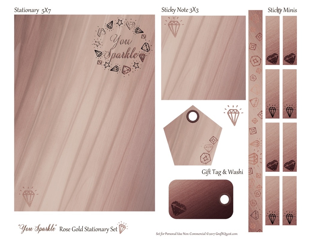
0 Comments
|
About this page.
Life in general is an art and I will show you how to find the beauty in everything you see and do. Subscribe and receive a free weekly download and updates. Archives
May 2019
Categories
All
Are you able to donate a $1 through PayPal to help assist this artist in keeping this extensive site alive. It is all out of pocket and costs over $50 a month to finance. If you enjoy this site it would really help. Thanks in advance! |

 RSS Feed
|
|
©1996-2022 GrafXQuest LLC All Rights Reserved.
|
|