Author: Lady T Powers 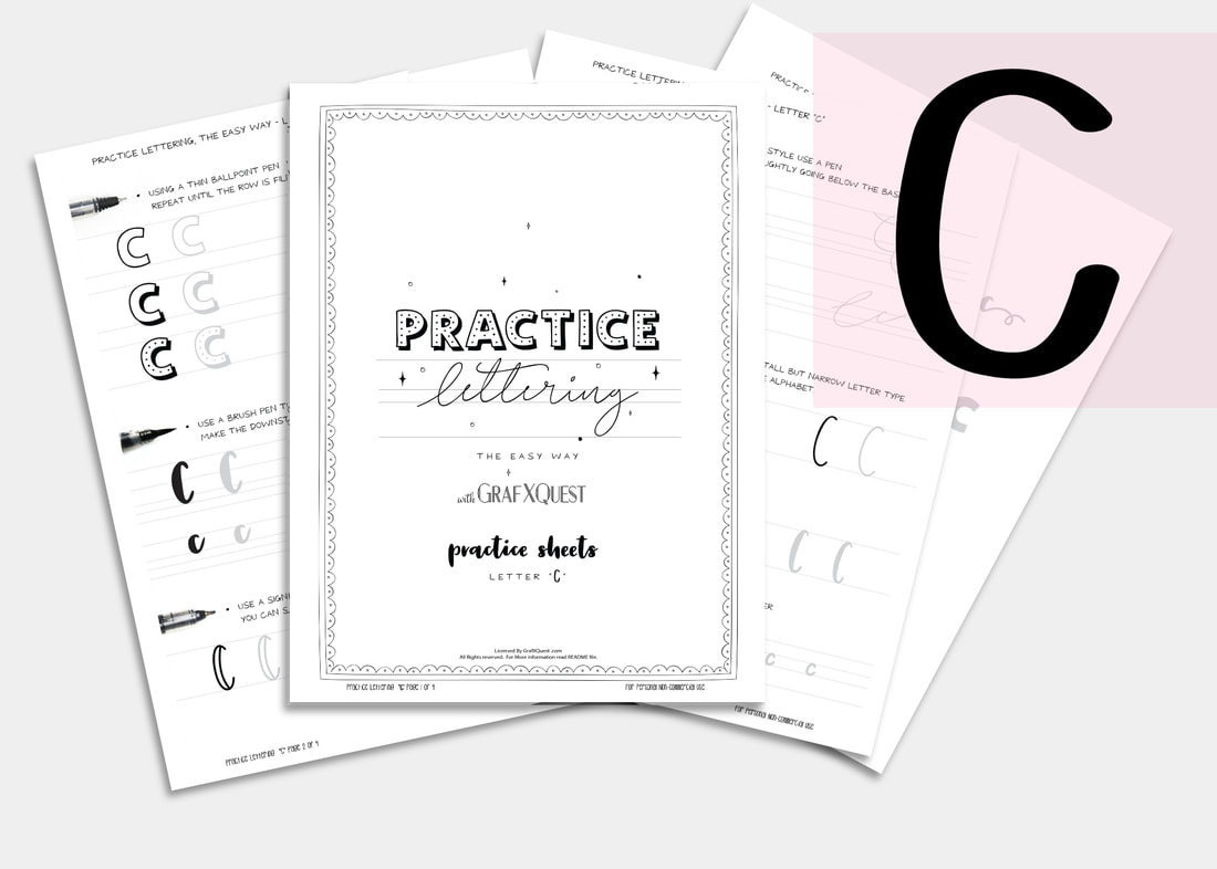 What comes next after B ? you guessed it, the letter C!
Practice Hand Lettering with GrafXQuest "Letter C" Set Following the instructions laid out in our last 2 posts on the letter A, and B, be sure to print out your letter C files to follow along. The Letter C Lesson will be available free until March 9th 2018, at which point it will then become a $1 to help support the site. All lessons are for letter formation and tips for learning Hand lettering and may not always apply towards the kit you are working on. However most of these lessons should assist in most if not all cases. Moving along we will assume you now have read the post on the letters A and B, and have printed out your C files and practice sheets, and are ready to work! Today we are going to talk about staying consistent. Consistency Stretching out your lettering is a mistake most beginners make especially when they try to add them later to a text editing program. Please do not stretch out your letters to get better spacing. Take the time to redraw them so that the thin and thick of your letters stay consistent with one another. 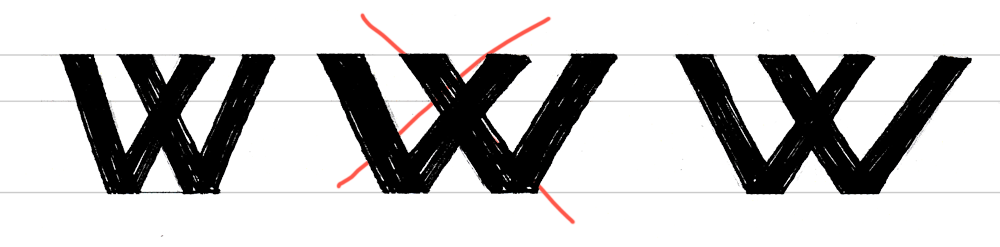 It’s a very important for the letters to look visually correct then it is for them to be on a perfect plane. There is no exact science to lettering or kerning, (kerning is the space between letters). So here are a few basic rules you to know to make sure your letters are looking their best. The difference in thin and thick strokes No matter how thick or thin your letters, your stems (vertical lines) should always be thicker than your crossbars (horizontal lines). This helps the letter appear more balanced. Horizontal and upper diagonal lines should always be thin, and vertical and bottom diagonals should always be thicker. 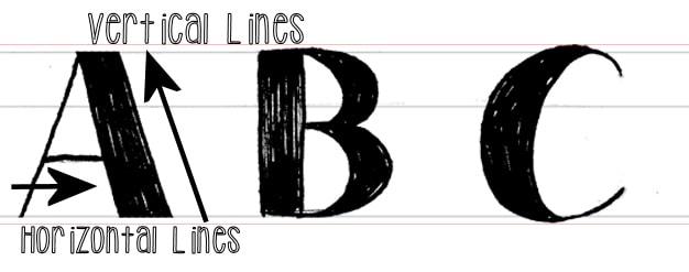 Even when designing thick mono-width lettering (where all letters appear to be the same thickness) this rule still applies. The difference though is it will be less noticeable. 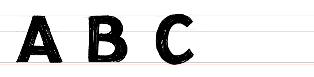 See how the horizontal lines going through both the A and B are slightly thinner? Diagonal Strokes When doing the diagonal stroke on N's, the center diagonal should be thicker. Outside lines should be thin since they both go up. Now, alternate strokes of the W and M are thick. This is again to make the letter appear not only balanced, but consistent. 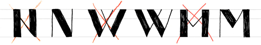 Use these practices when drawing your AB and C's and pretty much any letter moving forward. Don’t be afraid to draw your lettering more than once, and don’t expect to get an award-worthy piece on the first try either. It takes patience and practice. Plus be prepared to use a ton of paper. I keep tons of scrap paper around just to work on lettering formation. We hope we have given you some additional insight into hand-lettering. Have fun working with the Letter C. The entire alphabet will soon be ready to purchase as a complete set. Until then we will D you next time! Have anything to share with us so far? Contact us we would love to see and share it with others! Need Additional Space to practice? Don't forget your calligraphy practice sheets that track the pen type you use and has six brackets set up for practicing whole lines or single letters. Thanks! ~ Lady T
0 Comments
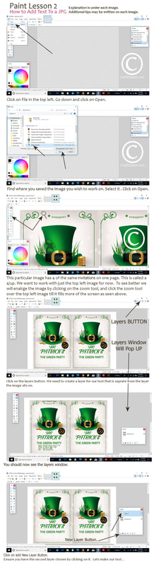
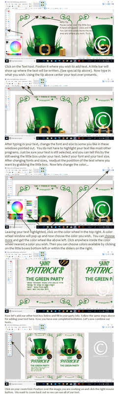
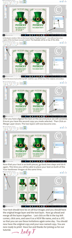
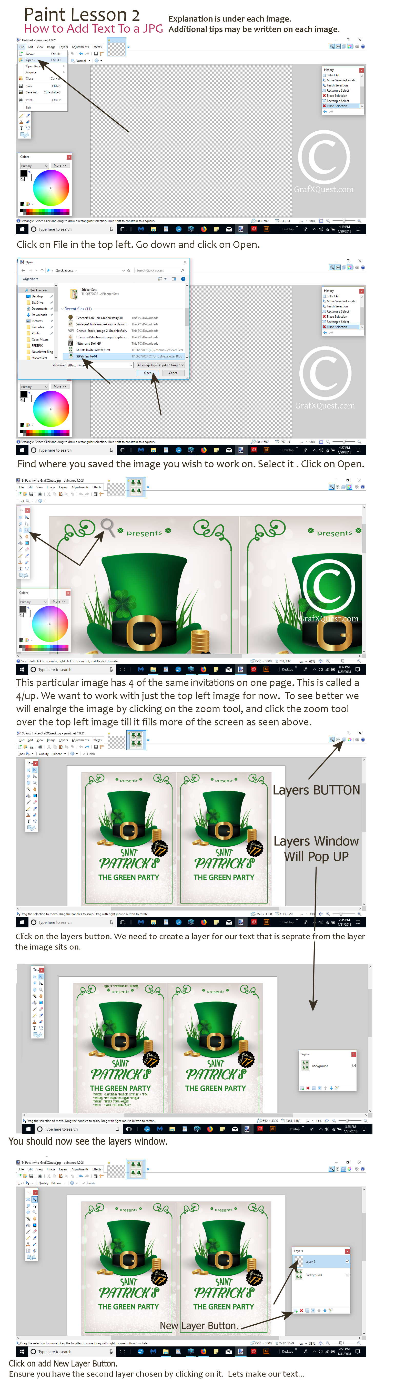
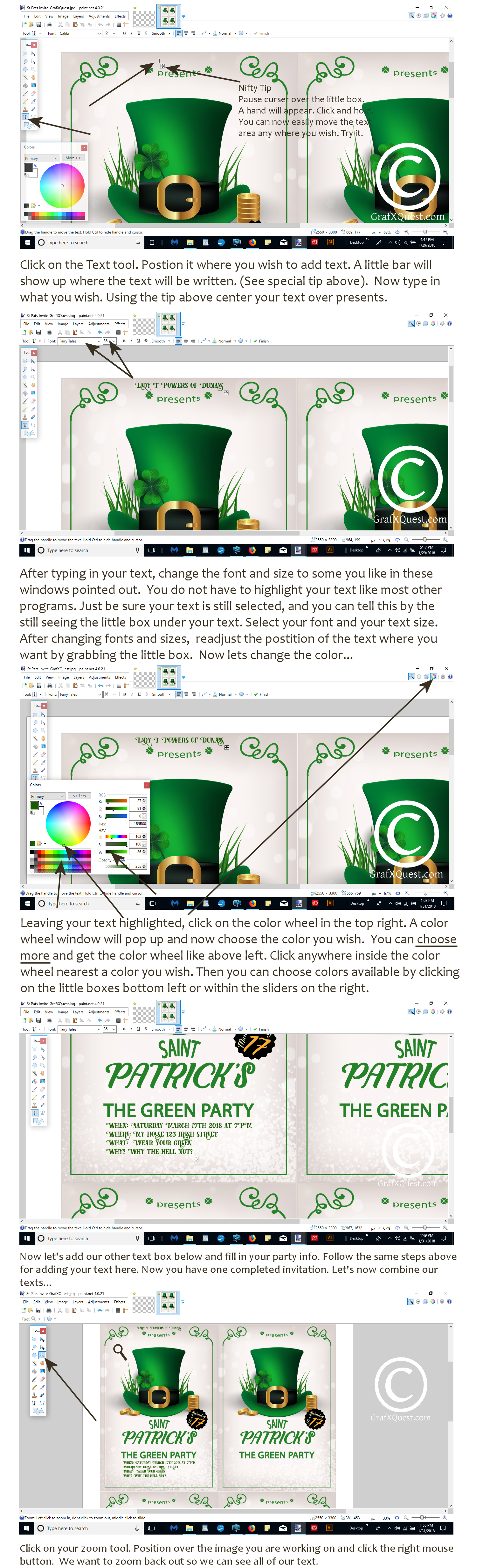
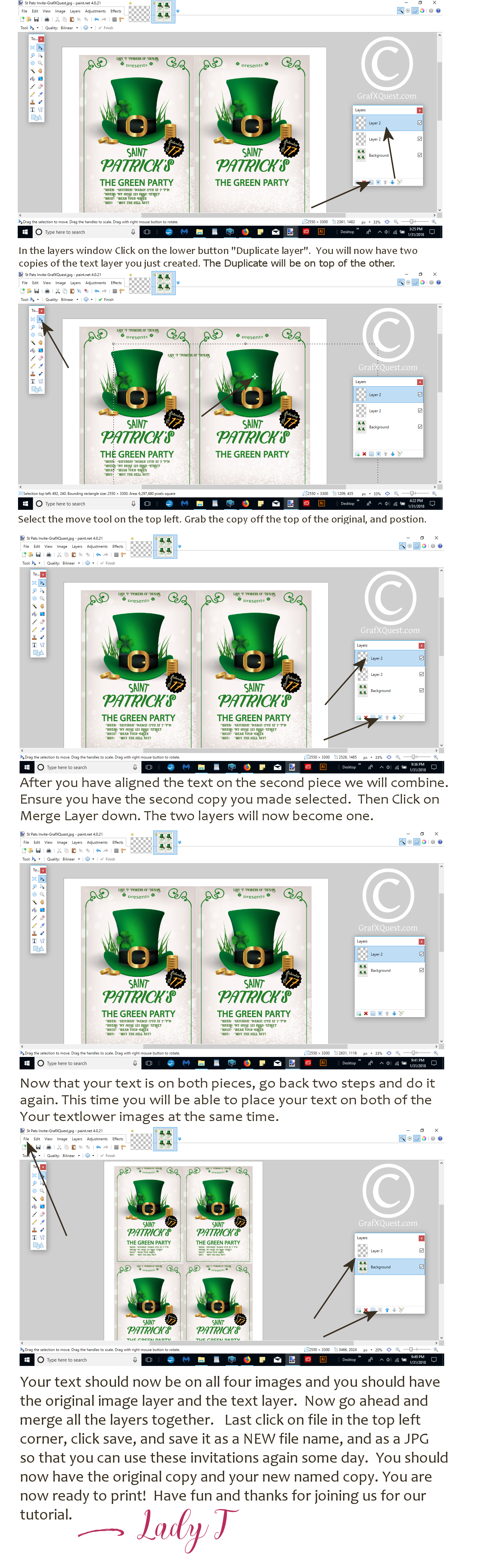
Article By Lady T Powers Hi, today I have for you a nifty little tutorial on how to add Text to a JPG file using PAINT which is a nifty little program that is very powerful and can do a lot of things like Photoshop but you don't need a subscription and you can get it for only $1.50 right now on our site. Using this program I will walk you through how to add Text to a JPG file. Note we will be using an invitation, but this will work for adding text to any JPG file like photos, cards, personalizing stationary and more. This tutorial will also be helpful if you do have Photoshop or Photoshop Elements as some of the procedures are nearly identical. Note the Tutorial will have a Copyright water mark over it and its just for legality reasons and has nothing to do with the lesson. Let's get started! Can't read the images? Right click on each of the 3 file extensions to open in a new tab, center mouse over image you should see a zoom sign, right click and read.
I used this fantastic bundle and I will show you what I created for my store. I was able to design two stationary sets in about 15 minutes using this amazing bundle. I chose to work with the Lisa Glanz "Cute Critter Creator" since it turns out so many new characters just by turning layers on and off in photoshop. Yes it was just that easy. If you click on Lisa Glanz's name you will see a similar portrait creator for people. You will also see she charges $39 for that set alone. However you get her creator Kit plus 28 other kits for only $29. This bundle holds over 27 Gig of creatives to use. Watching the video above you will learn how to use this bundle in many ways. The below images show each individual package you get in this bundle for only $29, that's $1 dollar each! OH! Did I mention it comes with a complete extended license to use for business? And no I am not selling this bundle, I am a RAVING fan! This is one of my prized resource go to places. They sometimes share their new bundles with me to do reviews. To be perfectly honest I feel they are getting the short end of the stick as I can create MILLIONS of designs from this for just a review. What is my ultimate opinion? I cannot live without my DesignCuts bundles. They make my life so much easier. I spend HOURS laboring on new drawings and creations, building my website, advertising, newsletter, social, and CEO. Its very very hard doing it all by myself. When I do not have time to create I use my Design Cut resources. And YES I do buy these bundles a lot. They have sent me goodies in the mail saying, you bought more than anyone else in this last month, thank you! ...OOps can you say junkie? I have scolded them that I have now downgraded from a home to a cardboard box, with net coming via old school from a telephone pole. Sigh...very true...but look what I created in 15 minutes. (See Below) 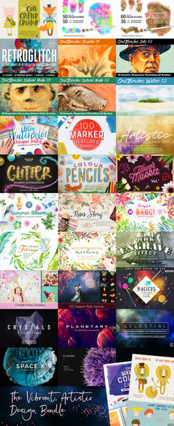
Everything you get in this bundle.
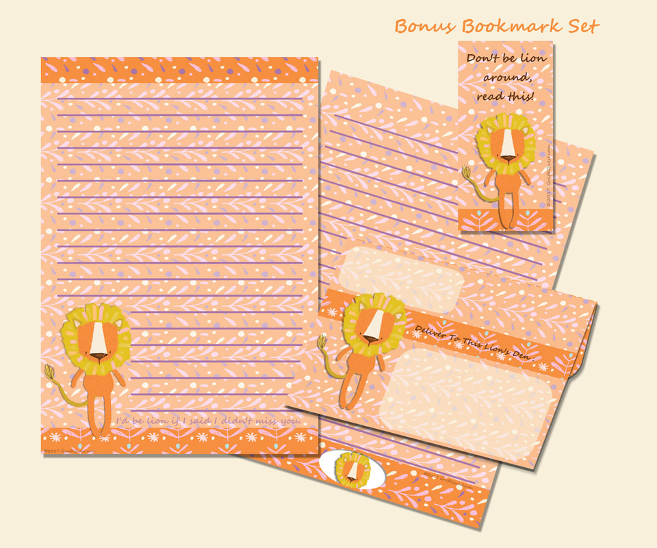
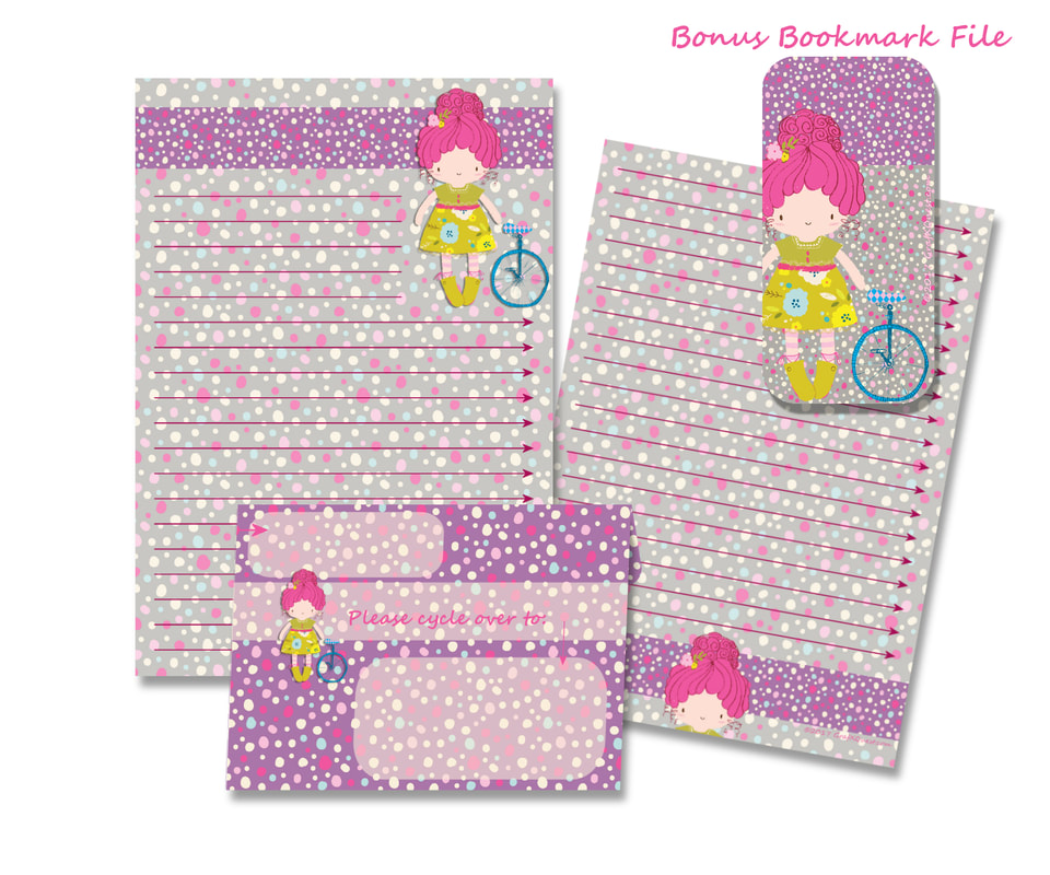
I created these two stationary sets, (both on sale for less than 30% for a limited time) in fifteen minutes. I opened the Lisa Glanz "Critter Creator kit" Which btw it also creates cute boys and girls (above) not just critters. I opened and closed layers to achieve each of the lion and girl creations. Using Photoshop I used Lisa's background patterns to create the papers, envelopes and bookmarks. I then dropped in the critter I created. Lisa includes very detailed instructions on how to use the creator. I was up and running in less than one minute. You choose their clothes, skin color, accessories and more. As you can see I have a lion Stationary set and a Little girl and her unicycle set. Since I need to continually fill my store as well as make creations for my clients providing them with new designs and product for my customers; havingDesign Cuts makes my life easier. Did I say easier? I meant I can breathe!
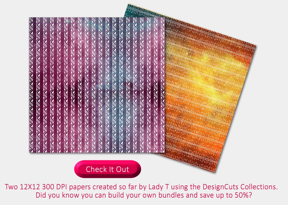
Check them out, (DesignCuts) they are also very friendly tell them I said HEY and sent you for a deal! Just a quick note though these deals only last about a week then they post a new one. The creator kit alone is worth around $39 so grab it quick if you are so inclined; sometimes you can get the individual packages alone but you will pay almost the $29 for just one of them. Sometimes there is something in the bundle that is never offered in the store so best to get them if you are inspired now. They also take PayPal which I use all the time. Very cool. And once again no I do not get compensation for you getting a bundle. My compensation is saving you time and money and hopes you come back to check us out often! Bye for now Hope you love! ~Lady T Hi friends! Glad you stopped by to check out this edition about choosing backgrounds for your designs. Below is an amazing background and texture package I picked up from DesignCuts for only $29. I am going to use some of it today to show you a few things you can do with it. I had a great time with this awesome bundle. If you find you are interested in it too get over there this second before it times out! It is available for only 8 more days. 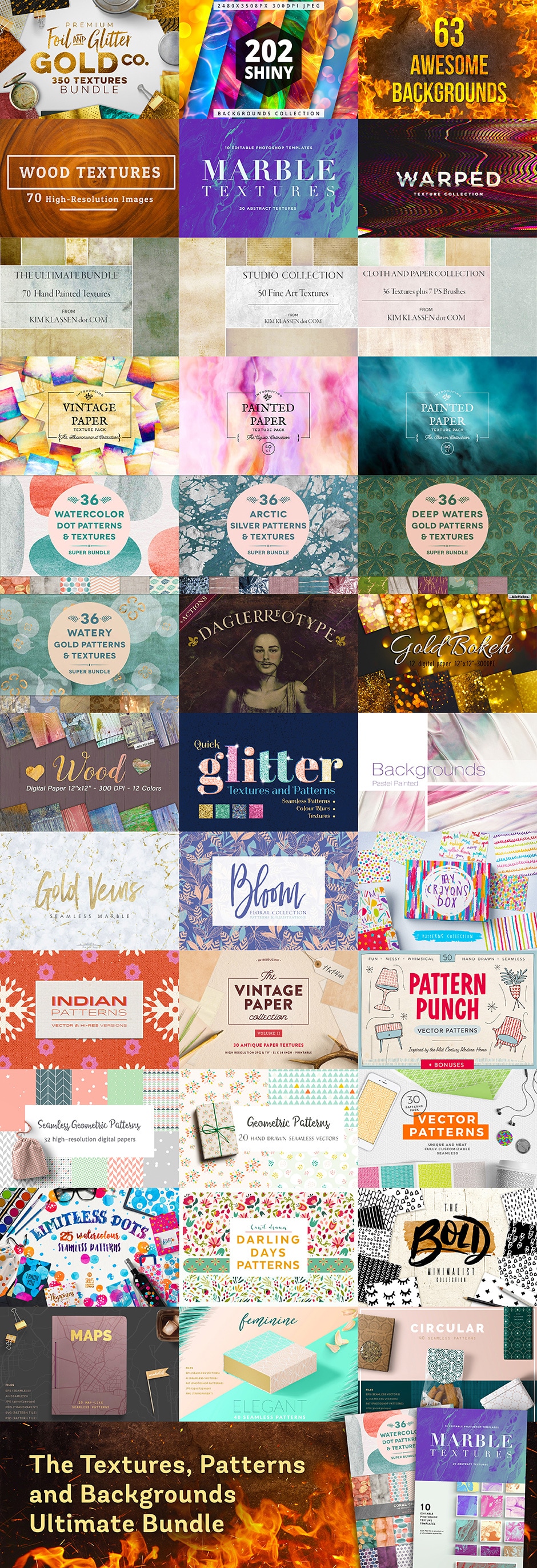 That's a lot to look at right? Yep and this bundle may help you a lot with answering the next question. So how do you go about choosing or creating a background image for your design, digital game, photographs, scrapbooks, cards, fabric, and pretty much anything else you can think of? Well its all about symmetry and using your gut instinct. It may also help to see what is up and coming and popular depending on the feel you are trying to achieve. For instance the most popular backgrounds right now are geometric, marble, faded or mute color, grunge (been in for a while). But are these right for you? Choosing a right background texture or pattern can totally set or break the mood of what you are trying to convey. So let us for an example say we are developing a website for deodorant. We could go a few ways to set the mood on our main page. We could try a grunge background texture behind our male model using one of the Kim Klassen samples above. What would that convey? Grunge could convey the dirty, stinky, route. By using a grunge texture for layers both over your model figure and behind in the background sets the mood to be used with the slogan; "Are you dirt nasty?" Try BoDOH! See left image below. 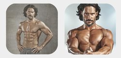 I used the same day photography images of actor Joe Manganiello (Sorry Joe) to prove that just changing a background can have a huge effect. On the left we were going for the grungy dirty look to "sell deodorant". On the right using a background from Hot Pixels, (Included in the bundle) we convey an entirely different feel. A more clean modern look that you might find on the front of GQ™ or Muscle Magazine™. Just by slightly dimming the actor by 90% on his layer in our Corel Photo Pro, gave us that more modern effect of muted/faded color and image without losing the clean feel. Now which one would you prefer to see on a deodorant website? And why? Again its about instinct and using your gut. What feeling are you trying to convey? What is YOUR message. Which one is going to sell your message? Here is another sample. Staff artist Angel Koch took images from the texture bundle to create a 9 page Planner sticker bundle. She was trying to convey a soft harmonious feel to this bundle. Did she succeed?  You can get this bundle at a discount here: PASSIONATE 9 Angel used the textures from the Bloom files included in the Texture Bundle. There are over a thousand images included in this texture bundle and she was able to create this set just using one small file of images. I personally love them. Here is what Angel had to say about it. Hi again GrafXQuest guests, it's Angel Koch again; President, Co Owner and designer of Flamango Door the Planner store here on GrafXQuest. I am back this week to play around with some graphics from DesignCuts. Once again there were really so many to choose from in the texture bundle that I had a hard time choosing what to start with! I decided to go with Bloom and I had plenty to work with! I created 9 planner sticker sets this time that I am very crazy about! I cannot choose a favorite. The patterns were super cohesive and I used matching solid colors for full boxes, half boxes, ombre boxes, headers, checklists, and movie marquees. I then printed them all out onto full sheet label stickers using my color inkjet printer at home, and kiss-cut them using an Xacto blade and a bit of patience. I put them in my own bullet journal using my go-to vertical layout reminiscent of Eric Condren and Happy Planner style. Here is my personal review of the graphics product above from DesignCuts: You get over a thousand of textures to play with for a tremendously good price! I was able to use the images without trouble, they easily fit into my Silhouette Studio program, no resizing or touching up at all, no converting to other file types, either. Working with them was a dream, and my planner stickers are beautiful! I would definitely recommend this bundle as I have enough to play with for months. The sale won't last long, though, so you'd better hurry! Thanks for your time -Angel Thanks so much Angel for playing with the bundle and giving us your valuable opinion. I also just created a freebie for our Newsletter followers, (below). Using the metallic rose gold patterns included in the package by Zepplin, I created a cute little stationary set. Unfortunately unless you are already signed up for our Newsletter you wont get this one as it has already launched; the one below is not full sized. But sign up for our Newsletter to get fun free printables like this one in the future. Now I am off to go use this texture pack to make some Paper, Spring Cards, and Mother's Day cards! See you on the flip side and thanks for joining us! `Lady T 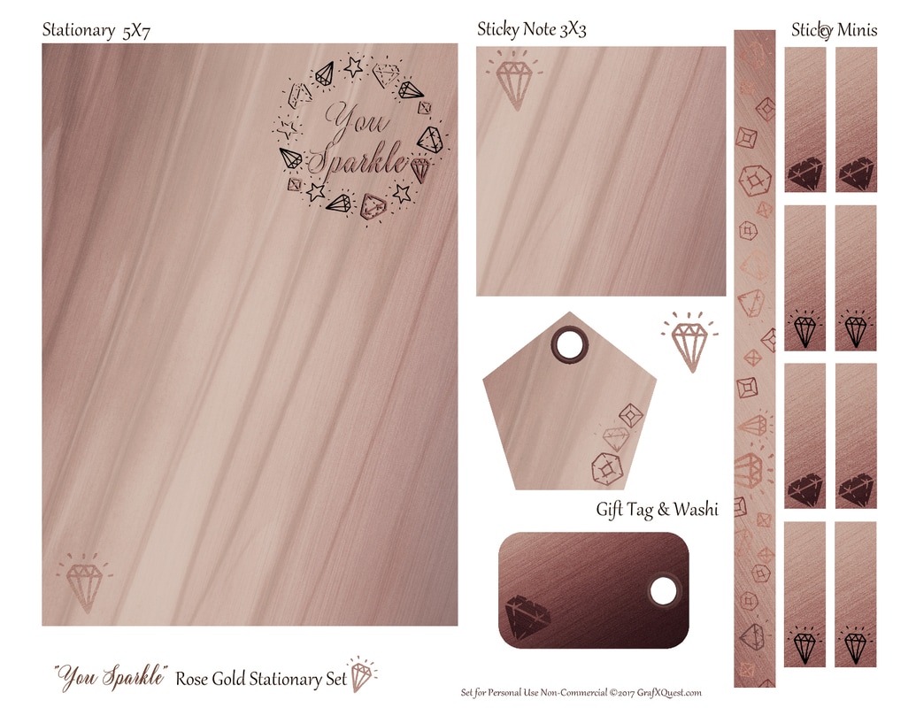 Hi all its' Lady T and let me tell you as a designer I am constantly on the hunt for visual digital content that is new, fresh, and will awe my guest, (customer) . I look for something that not only grabs the eye but takes your breath away. Something that makes you say 'I wish I had thought of that or I can't live without that'. If I haven't accomplished that then I haven't done my job very well as a designer. And that would be “AWE”ful. I create a lot of my content but not all of it. It takes a lot of time to be your own art director, artist, marketing department, and publicist. So how does one go about finding good content that not only inspires, but also fits within your budget and lets you wear the hat of many roles? Buying art from other people to use in your own products can be very expensive can't it? And what about creative licenses, that can be sticky too. The answer is to do a lot of research on the internet and occasionally you get extremely lucky and trip over a phenomenal find like DesignCuts. What is extraordinary about this company in particular is they bundle design packages by top Artists in the country that can be used together or separately. They offer an amazing amount of content in the bundle and the bundles usually are only $29 USD. The best thing of all is that they offer an extended license on their bundles which means I can use their content from these bundles over and again commercially. That makes it extremely valuable to me because this content can be used in so many ways from creating backgrounds to foregrounds to digital papers, letters and more you name it AND I can sell what I make with it, not just for personal use. Because we use a lot of content from DesignCuts they have asked us to try out and do an honest review of their most current bundle “The Inspiring Artistic Design Collection”. Are you kidding?! Bring it on! First lets start with what came in the collection and then I will show you some samples of what I did. I will then also share our guest artist; Angel's personal opinion as she worked with one portion of the bundle in particular and rocked it out. This creative collection knocked my panties off featuring thousands of assets built to save serious time in my creative work. Professional logos with a super epic Feminine Logo Creator, realistic brush details with GrutBrushes and Retro Supply Co, and gorgeous watercolor touches and kits. There is a Woody texture design kit to change your text to wood and Cloud effect brushes unlike any I have ever seen. Vintage constellation and Medical kits, and and...ok I am loosing my breath because I got so excited! But there is a lot of stuff. So lets look at some of the things we played with! 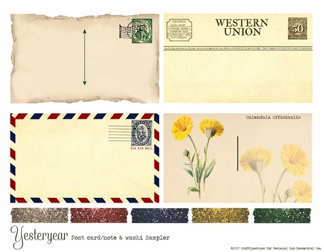 First I created an exclusive freebie for my newsletter followers called Yesteryear, (shown here) which features several elements I pulled from the “The Inspiring Artistic Design Collection”. I used the included Pattern Pop collection for the washi samples which were in PNG formats with clear backgrounds. I was able to pull those in and size them down to half inch strips. Even though the Pattern Pop washi comes with gold, silver and rose gold pieces, they were very easy to re-colorize in Corel/Phototshop to match the freebie color tones so that is what I did. I then used the Eclectic Anthology kit for creating the actual post cards with ripped edges, corners, the vintage paper creator, and the huge collection of antique stamps and cancellation stamps. It was a dream to use and very easy to put the images together to make these vintage looking pieces using layers. I also re-colorized some of these pieces as well which was super easy to do as the PNG's are super clean images and a dream to work with. The hard part was choosing which stamp. There were well over 60 beautiful ones to choose from. The third kit I used from this bundle for the note cards was from Vector Hut, whose focus is to collect, restore and re-purpose old and forgotten artwork that they find within pre-1900s books and ephemera. I chose a Marigold but decided to go with the scientific name when creating the card because that would have been more typical to the era found in printed items. Well I am going to run off to play with some more stuff, I am going to create some 12X12 300 DPI digital papers now with the Sky Box Creative set. Want to see two so far? Stay tuned and see Below! Go check out the bundle...and see you around the intergalactic water-cooler ;) I will let Angel take it from here, well...ok actually in two more paragraphs I will! Angel has been working on an extensive 5 page planner sticker set with well over 400 stickers for planners, journals and bullet planners. This set is absolutely heart stopping, brain altering, breath capturing goodness and she did it by choosing the Mix Pix Box's collection of Lights & Stars from “The Inspiring Artistic Design Collection”. So what does Angel say? Ok Angel NOW its' your turn. Hi GrafXQuest guests, I am Angel Koch; President, Co Owner and designer of Flamango Door the Planner store here on GrafXQuest. I had the opportunity this week to play around with some graphics from DesignCuts. There were really so many to choose from in the bundle that is on sale right now, I had a hard time choosing what to start with! I decided to go with the Lights and Stars pack, focusing on the 22 backgrounds and leaving the layering pngs for another time. I had plenty to work with! I created 5 planner sticker sets that I totally love! I cannot choose a favorite. I wanted to highlight the patterns as much as possible, so I didn't use any solid colors for full boxes, half boxes, ombre boxes, headers, checklists, or movie marquees. I printed them all out onto full sheet label stickers using my color inkjet printer at home, and kiss-cut them using an Xacto blade and a bit of patience. I put them to use in my bullet journal using my go-to vertical layout reminiscent of Eric Condren and Happy Planner style. Here is my personal review of the graphics product from DesignCuts: You get so much to play with for a tremendously good price! I was able to use the images without trouble, they easily fit into my Silhouette Studio program, no resizing or touching up at all, no converting to other file types, either. Working with them was a dream, and my planner stickers are beautiful! I would definitely recommend this bundle. The sale won't last long, though, so you'd better hurry! 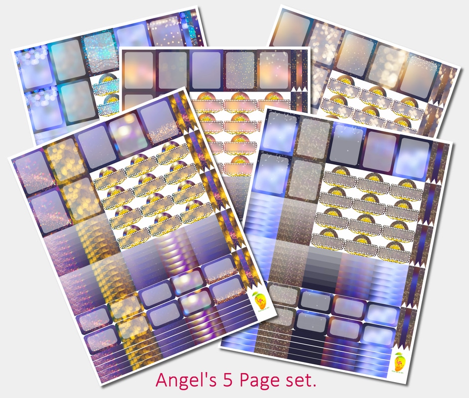 Angel is right there is an end date on this super cool bundle and it ends in a couple of days. Just think of all the things you can do with it, cards, stationary, gift wrap, zazzle material, T-shirts and it just doesn't end there. Why am I telling you this? Because I use their product all the time and I wouldn't tell you about someone unless I used them first and approved. It is high quality and the waiting list for high end artists to submit material to DesignCuts is long. Even I have tried to get on it and have been turned down for now. The list has some heavy hitters on it. But that is puuurrrfectly fine with me I will just continue to lick up the cream. ;) If you create something with this bundle by the way I want to see it. Submit it to us through our contact form to share with others, we want to show your talent. God Bless!
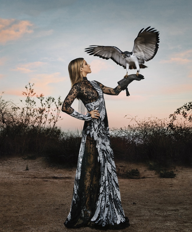
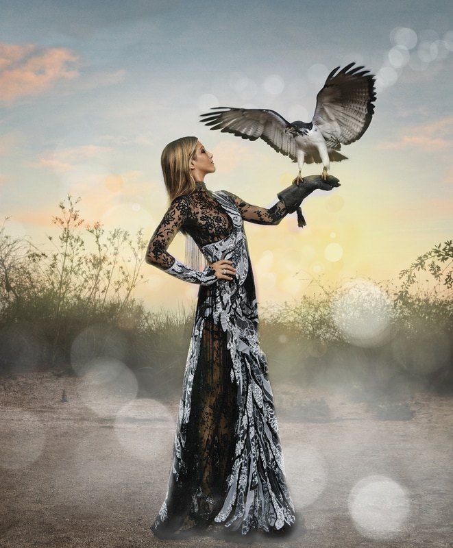
PS I almost forgot! I wanted to show you how versatile these bundles are and why I am a raving fan. Way above earlier Angel used the Mix Pix Box Light & Stars to create her 5 page sticker package. To give you an idea of how versatile these design collections are for using with your own products I used that same package but on this photo on the right. See how I was able to add a more magical and whimsical touch to the image on the right just by overlaying some of the PNG's from the Mix Pix Box set and then going back over the model and the Hawk with an eraser. This gave them a more glorious and shining appeal don't you think? Fun stuff!
|
About this page.
Life in general is an art and I will show you how to find the beauty in everything you see and do. Subscribe and receive a free weekly download and updates. Archives
May 2019
Categories
All
Are you able to donate a $1 through PayPal to help assist this artist in keeping this extensive site alive. It is all out of pocket and costs over $50 a month to finance. If you enjoy this site it would really help. Thanks in advance! |
|||||||||||||||


 RSS Feed
|
|
©1996-2022 GrafXQuest LLC All Rights Reserved.
|
|