|
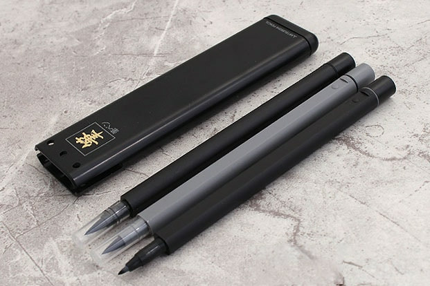
By: Lady T Powers & JetPens 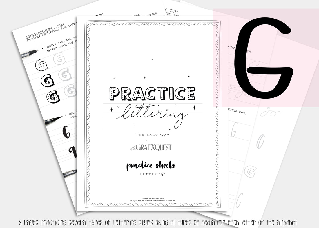 Now For the letter G Several posts ago we started you out with some practice sheets so you can start getting the feel of playing with lettering. You will also be able to print those sheets out as many times as you like to have extra space to practice the above lesson. You can get them here: Practice Sheets. You can also see the previous posts you missed starting with the Letter A here : Lesson A Get the print outs here: Letter A Printouts , Letter B Printouts , Letter C , letter D, letter E and letter F Printouts! Want to share these with someone else? We ask that you do not share our files, instead share our link above to this post. Thanks. Be sure to read the first post for letter A as it will have some important hints to help you along with the rest of these lessons. Lets Move on to to the letter F. Following the instructions laid out in our last posts on the letters A, B, C, D, E and F be sure to print out your letter G files to follow along. The Letter G Lesson will be available free until March 26th 2019, at which point it will then become a $1 to help support the site. Hurry get it now. All lessons in this blog are for letter formation and tips for learning Hand lettering and may apply indirectly towards the kit you are working on. However these lessons should assist in most if not all cases in developing your lettering skills with these lessons. We will assume you now have read the posts on the letters A,B,C,D, E and F plus have printed out your G files and practice sheets, and are ready to work! Today we are going to talk about best brush pens for lettering and calligraphy. PART 2 Beginners Dramatic Lettering & tools to try Let me first start by saying, that by no means should you rush out to buy these supplies. You can always use what you have on hand. But it's always good to be exposed to different methods. We’ve all seen beautiful lettering with extra crisp hairlines and whimsical twirls. In this case it is helpful to have tools that can make this easier. For dramatic lettering, the brush pen tip should be soft and elastic so that you get more stroke variation. Pigmentation is also another consideration. We will look at both today. I do recommend using a dark black ink to convey your message boldly. Additionally, seek out brush pens with archival ink—you want your beautiful lettering to last! Without archival ink over time your lettering may fade. 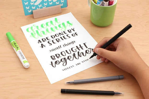 The Royal Talens Ecoline Watercolor Brush Pens (Below) and Uni Brush Pen Set are great for dramatic lettering.
Let's see this pen in action... WaterColor Calligraphy Pens
Let' see these pens work... Create shadows and 3D effects
next time... 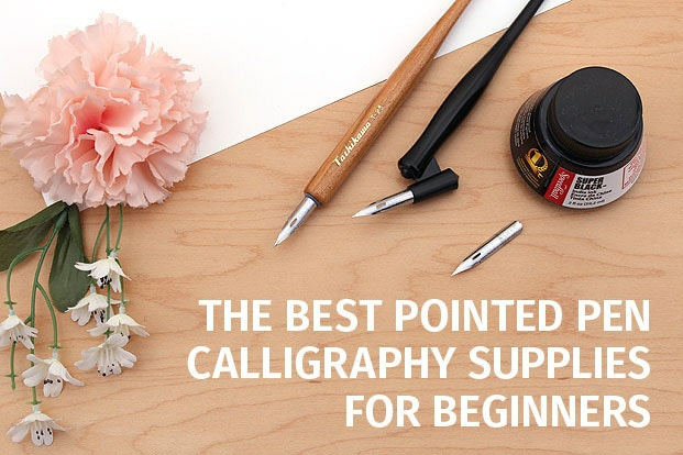 Next time we will continue this post with additional tools for beginners. If you frequent social media or have been to a wedding, chances are you’ve seen how beautiful calligraphy can be. If you’ve ever wanted to learn calligraphy yourself, this article is for you. We will go over some of the basic calligraphy tools you’ll need to get started and show you how to use them. We will also be presenting you with the letter H practice kit for free!
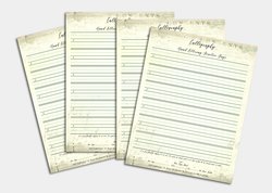
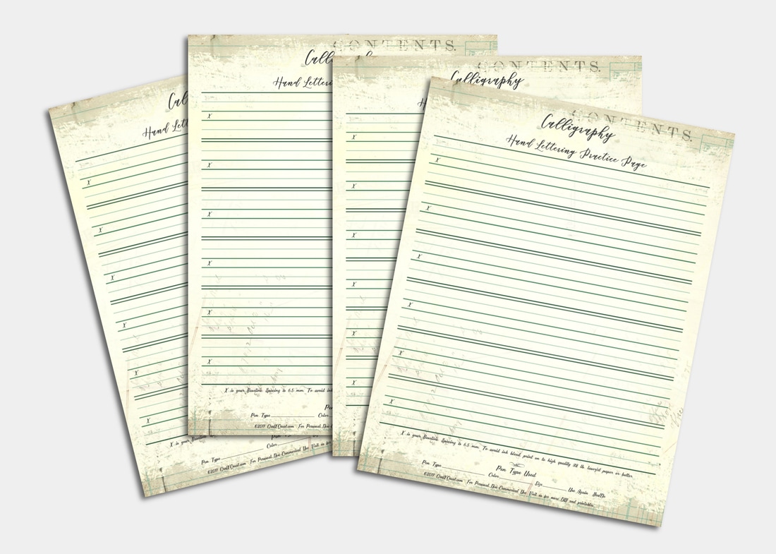
Will you Share your work with us? We would love to feature you. Contact us with what you have done so far and submit your images to us as well as any tips or hints you have found so far in your journey with us. We would love to share to help everyone! We hope we have given you some additional insight into developing your hand-lettering. Have fun working with the Letter G practice sheets. I highly suggest printing them on to HP Printer Paper, Premium 32. Now that you have some insights on pens and why, (hints on practice sheets too) begin following the directions on your G Sheets. The entire alphabet will soon be ready to purchase as a complete set. Until then Hhhh...eck it was good seeing you! Need Additional Space to practice? Don't forget your calligraphy practice sheets, now featuring an extra bonus, that track the pen type you use and has six brackets set up for practicing whole lines or single letters. See you next time! Thanks! ~ Lady T
0 Comments
Author: Lady T Powers 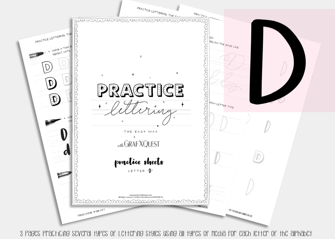 What comes next after C ? right... the letter d! 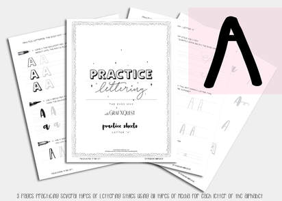 Several posts ago we started you out with some practice sheets so you can start getting the feel of playing with lettering. You will also be able to print those sheets out as many times as you like to have extra space to practice the above lesson. You can get them here: Practice Sheets. You can also see the post you missed on the Letter A here : Lesson A and get the print outs here: Letter A Printouts and Letter B Printouts and Letter C Printouts and now letter D Printouts. Want to share these with someone else? Please do not share our files, instead share our link above to this post. Thanks. Be sure to read the first post for letter A as it will have some important hints to help you along with these lessons. Lets Move on to to the letter D. Following the instructions laid out in our last 3 posts on the letter A, B, and C be sure to print out your letter D files to follow along. The Letter D Lesson will be available free until April 6th 2018, at which point it will then become a $1 to help support the site. All lessons in this blog are for letter formation and tips for learning Hand lettering and may not always apply towards the kit you are working on. However most of these lessons should assist in most if not all cases. Moving along we will assume you now have read the post on the letters A,B, and C and have printed out your D files and practice sheets, and are ready to work! Today we are going to talk about handlettering tools. 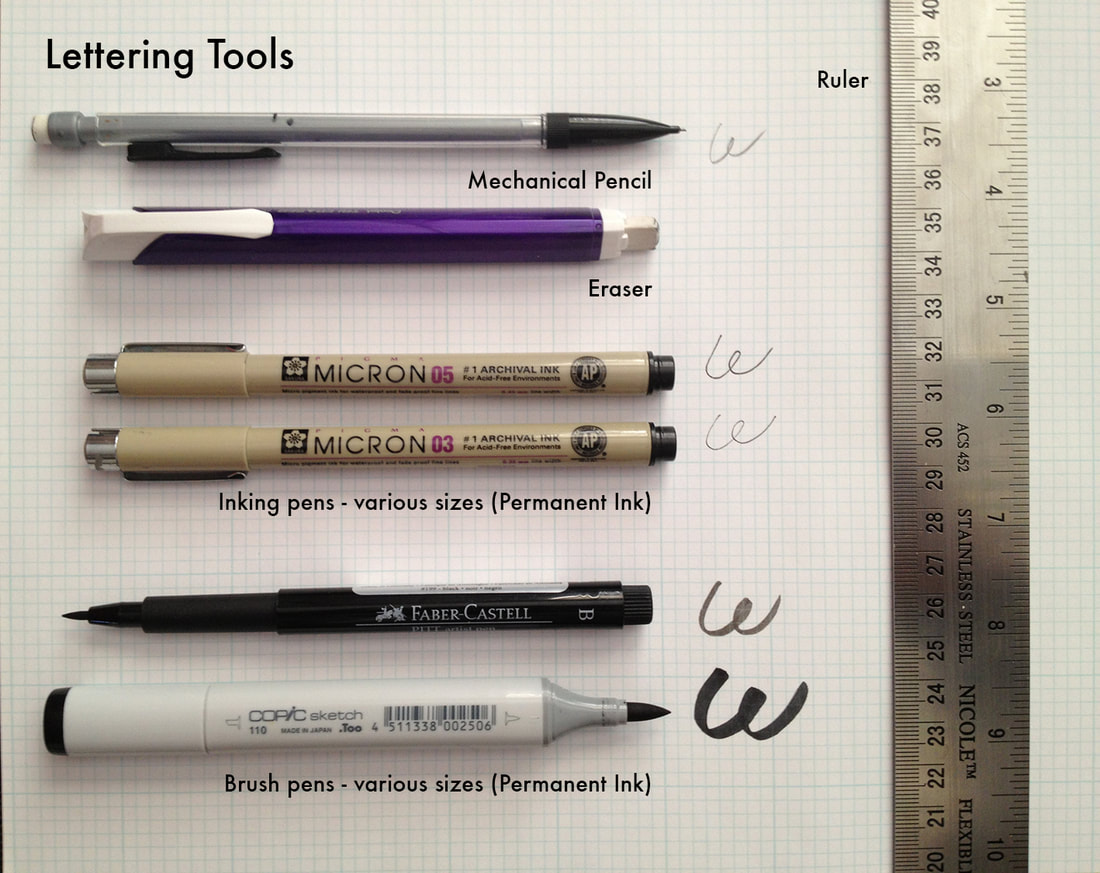 Hand Lettering styles are gorgeous and look so fluent and easy until you try them. All of a sudden you realize you are either good at them or well, just plain stink! However there is good news for you fellow stinkers, anyone can learn it – it just takes practice. I compiled some hand-lettering tips from HOW Design University‘s lettering extraordinaire, Denise Bosler, to help you with your lettering practice. First, you need the right tools, and we borrowed this practical tool guide from Denise Bosler’s Hand-Lettering Power Course. You can either use graph paper for handlettering or even better yet the practice sheets we prepared just for this. Whichever form you use this will help in building on your consistency which we discussed in our previous post with the letter C. Basic Hand-Lettering Tips: Lettering is not the same thing as handwriting. When you are lettering, you are actually drawing the form of the letters. Create a library of inspiration. Browse Pinterest and YouTube as lettering artists frequently publish their work on those sites. We recommend following Denise Boslers Pinterest boards as she always posts fantastic resources for inspiration. But the point is you need reference materials that you can copy or trace over to learn how to build fluidity and your own style. Look to typographic design for inspiration. Denise Bosler advises that “the best way to start [lettering] is by copying from existing typefaces to get to know the feel of the letterforms.” Trace known typefaces, such as Arial, using the grid paper. Pay close attention to the spacing, line heights and widths. Then practice practice practice. Our Letter D comes with several type faces to learn which are consistent with the rest of our alphabet. Try learning those first as there is lots to inspire you and space to learn. Remember to follow the rules of typography. (If you’re new to typography, here’s a handy list of typography terms. Refine, refine, refine. Once you have sketches of your lettering, refine until the letters follow the typographic rules. Refining might take several tries. This is why you need an eraser nearby as you’ll use it often. Always start with a pencil. Use several sheets until you have the perfection you desire before adding your ink. The tools above are merely suggestions and there are more types on the Practice sheets included. One thing I cannot stress enough is practice. With practice you CAN be just as good as the professionals and can use it for so many things. CARDS, TAGS, GIFTS, WEDDING ANNOUNCEMENTS, WALL ART, START YOUR OWN BUSINESS. If you ever had doubts that you can not do it? You are dead wrong. You can do anything your mind sets to if you are willing to put effort into it. Try some of the tools above. Pick up your free copy of letter D today while it lasts. Share your work with us? We would love to feature you. Contact us with what you have done so far and submit your images to us as well as any tips or hints you have found so far in your journey with us. Join us again soon for the Letter E. We hope we have given you some additional insight into hand-lettering. Have fun working with the Letter D. The entire alphabet will soon be ready to purchase as a complete set. Until then we will E you next time! Need Additional Space to practice? Don't forget your calligraphy practice sheets that track the pen type you use and has six brackets set up for practicing whole lines or single letters. See you next time! Thanks! ~ Lady T
Author: Lady T Powers 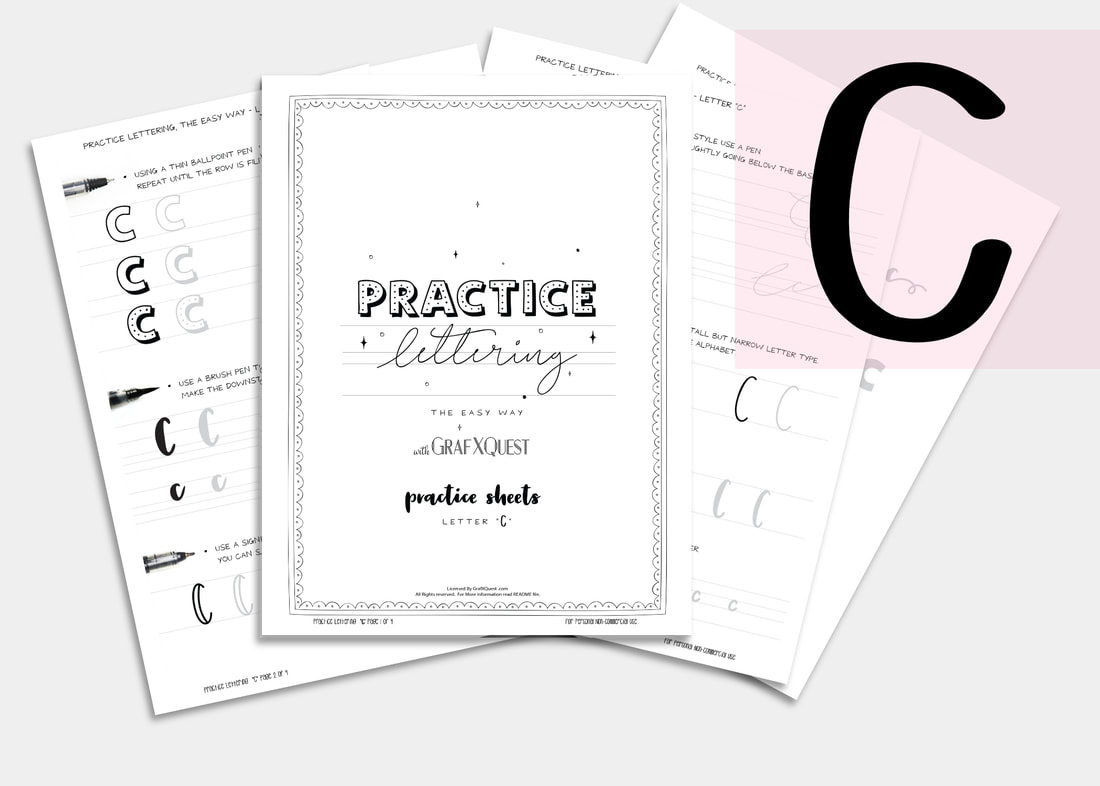 What comes next after B ? you guessed it, the letter C!
Practice Hand Lettering with GrafXQuest "Letter C" Set Following the instructions laid out in our last 2 posts on the letter A, and B, be sure to print out your letter C files to follow along. The Letter C Lesson will be available free until March 9th 2018, at which point it will then become a $1 to help support the site. All lessons are for letter formation and tips for learning Hand lettering and may not always apply towards the kit you are working on. However most of these lessons should assist in most if not all cases. Moving along we will assume you now have read the post on the letters A and B, and have printed out your C files and practice sheets, and are ready to work! Today we are going to talk about staying consistent. Consistency Stretching out your lettering is a mistake most beginners make especially when they try to add them later to a text editing program. Please do not stretch out your letters to get better spacing. Take the time to redraw them so that the thin and thick of your letters stay consistent with one another. 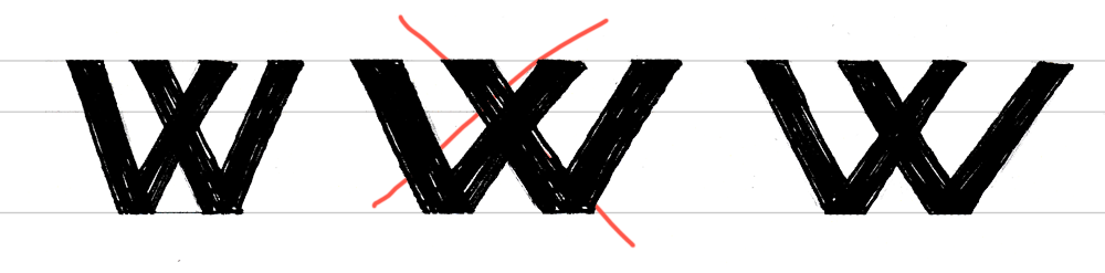 It’s a very important for the letters to look visually correct then it is for them to be on a perfect plane. There is no exact science to lettering or kerning, (kerning is the space between letters). So here are a few basic rules you to know to make sure your letters are looking their best. The difference in thin and thick strokes No matter how thick or thin your letters, your stems (vertical lines) should always be thicker than your crossbars (horizontal lines). This helps the letter appear more balanced. Horizontal and upper diagonal lines should always be thin, and vertical and bottom diagonals should always be thicker. 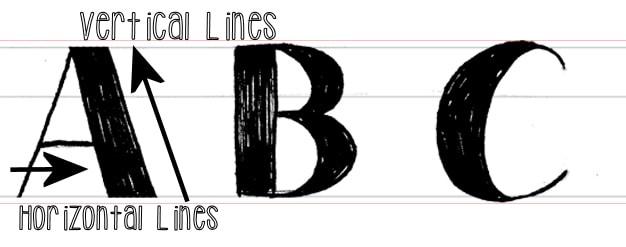 Even when designing thick mono-width lettering (where all letters appear to be the same thickness) this rule still applies. The difference though is it will be less noticeable. 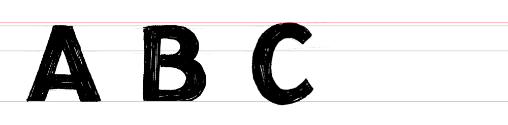 See how the horizontal lines going through both the A and B are slightly thinner? Diagonal Strokes When doing the diagonal stroke on N's, the center diagonal should be thicker. Outside lines should be thin since they both go up. Now, alternate strokes of the W and M are thick. This is again to make the letter appear not only balanced, but consistent. 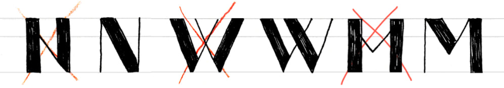 Use these practices when drawing your AB and C's and pretty much any letter moving forward. Don’t be afraid to draw your lettering more than once, and don’t expect to get an award-worthy piece on the first try either. It takes patience and practice. Plus be prepared to use a ton of paper. I keep tons of scrap paper around just to work on lettering formation. We hope we have given you some additional insight into hand-lettering. Have fun working with the Letter C. The entire alphabet will soon be ready to purchase as a complete set. Until then we will D you next time! Have anything to share with us so far? Contact us we would love to see and share it with others! Need Additional Space to practice? Don't forget your calligraphy practice sheets that track the pen type you use and has six brackets set up for practicing whole lines or single letters. Thanks! ~ Lady T
Author: Lady TPowers  what comes next after a? you guessed it, the letter B!
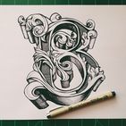
Following the instructions laid out in our last post on the letter A, be sure to print out your letter B files to follow along. Letter B Lesson will be available free until July 21st 2017, at which point it will then become a $1 to help support the site. Moving along we will assume you now have read the post on the letter A, have printed out your B files and practice sheets, and are ready to work! Today we are going to talk about Flourish. Have you heard the word? Flourish simply put, is the pretty little squiggles and lines added to a letter to make it look stylized. If you do a search for the term flourish it states, "noun noun: flourish; plural noun: flourishes 1. a bold or extravagant gesture or action, made especially to attract the attention of others." I found this description funny and very accurate as this is exactly the point of using a flourish on your letters. Adding a flourish to your letters lets it set the mood of whatever message you are trying to convey. Look at page 2 of your B Lesson. You will see that we start working with some flourishes. 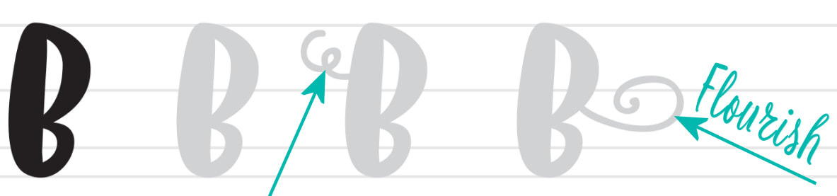 Perhaps you have seen a one page document or a story book where a very heavily flourished letter begins the story. Having a flourished and stylized handlettering can call attention to your note cards, stationary, journals and prints. Sometimes that first letter may even be another color. Sometimes an artist will begin each new line in a short phrase with a flourished letter. Here are some wonderful examples of flourished letters.
Now before going all crazy and trying to do these, understand that they took a lot of work and practice. Start out small with your lesson and work your way up to letters such as above. When you are ready to advance to something like above I suggest investing in a light table, and some tracing paper. Printing out an image like above you can adhere it to the light table, place your tracing paper over it and start trying to mimic the flow of the letter. Remember that the images of letters you find on the internet are more than likely copy-written materials and you will need to develop your own style should you wish to make a living doing hand lettering. However if it is for your own personal use than it is usually ok. When working with your letter B practice sheets try varying the pressure of your pen when doing upward and downward strokes. This can change the look of the flourish and the feel of the letter. Using thinner lines can make it more elegant and using more bold lines can give a strong presence. Flourish is also used between sentences, and added sometimes to an end letter or sentence to wrap around and include the front of the sentence, depending on the length of your message or line. It can also be used to create a border around your message.
Author: Lady TPowers 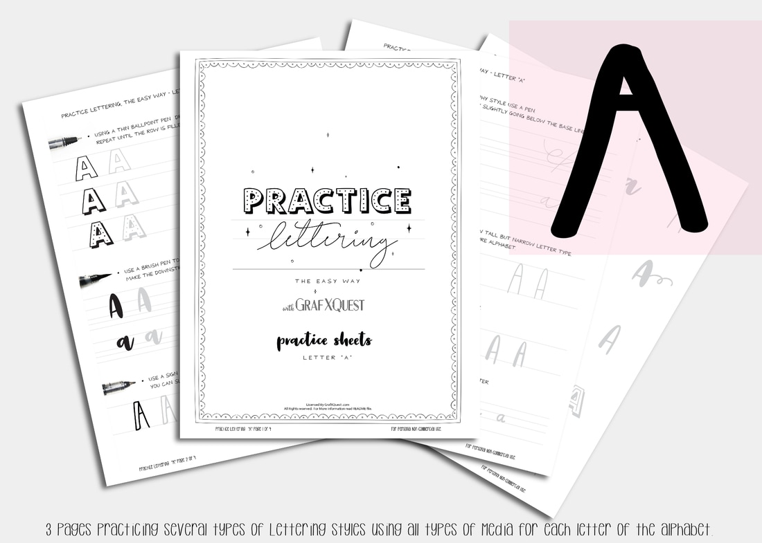 Starting with...you guessed it the letter A
First let us start by printing out your letter A practice sheets. If you can see what I am talking about it will be better for your visual understanding. I suggest printing on a laser printer if you have it as it is crisper and or using the black and white setting on your printers to save ink. I have included a PDF version and JPG for your convenience of printing whichever is easiest. For a limited time each of the newest launched practice sheet sets will be available for free. I suggest joining our Newsletter for updates on this so you wont miss them when they are free. After the initial launch period is over (1 week) each of the sets will then be available for $1, (to help support the site). You will also be able to purchase the whole Alphabet set, (coming soon) for a discounted price if you are impatient to really dig in or need to catch up. Ok, all printed? let's go!
Next Tip. When working with hand lettering its best to practice uniformity by positioning your hand at the same angle for making each letter, as well at watching the heights. Asymmetrical, (having parts that fail to correspond to one another in shape, size, or arrangement; lacking symmetry) is sometimes fun depending on what lettering you do and your intent, but it can also make your lines look sloppy. If you trace over the letters in the practice you will get a hang for the uniformity of that particular style and angles. Try not to deviate.
I also suggest printing out some of the calligraphy practice sheets as well so that you can work on each of the individual letters after the lesson and compare them to the practice sheets to see how you are doing. The Calligraphy sheets will also help you keep track of what pen you used for that session. Ok ready to give it a go on your own? Get to it! I really wish to know how you do with this so comment and let me know. See you next time with the letter "B"! |
About this page.
Life in general is an art and I will show you how to find the beauty in everything you see and do. Subscribe and receive a free weekly download and updates. Archives
May 2019
Categories
All
Are you able to donate a $1 through PayPal to help assist this artist in keeping this extensive site alive. It is all out of pocket and costs over $50 a month to finance. If you enjoy this site it would really help. Thanks in advance! |


 RSS Feed

|
|
©1996-2022 GrafXQuest LLC All Rights Reserved.
|
|