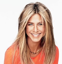
So is it an art to create Vintage photos? Well yes but it doesn't have to be. This photo I did of Tom Cruise took me about 15 minutes. And I am quite happy with the results. Below I will tell you what you need if you want to create something like the Tom Cruise photo. Why Tom Cruise? He is gorgeous...I don't think I need any other reason and he looks awesome in vintage. Ok so here is what you will need. You will have to have some kind of photo editing software and happily there are free ones out there. The cool thing is I didn't use any advanced tools in any of the programs. Anyone should be able to do this. You can download Adobe Photoshop for a free trial, or download Gimp, (which I find to be a bit non user friendly) but there are many out there just google free Photoshop programs. They will need to be able to erase, airbrush and create layers. The Tom cruise vintage photo was done with 3 layers. The original photo, a piece of digital grunge paper, and an old tin type frame. That's it. You can find these items again by doing a simple search on google. When typing in "Grunge Paper" to Google there are many choices. This is one that I found cool.
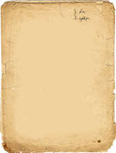
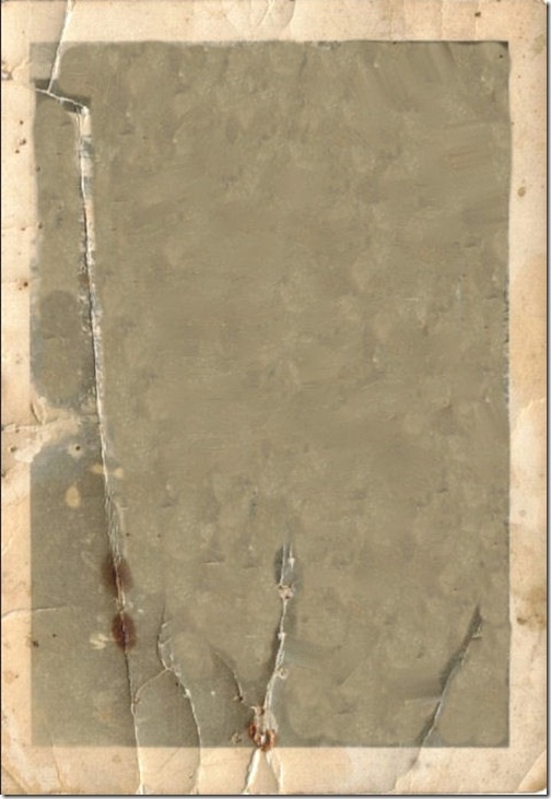
Now that we have our three images we need to meld them together. You want to start a "New" Image in your chosen program under the top left corner menu choice of "file". I chose a 8X10 inch format and 150 DPI if your program asks. DPI is the resolution in "dots per inch" The higher that resolution the better your print outs will be but 300DPI is HUGE and you will probably only need 150 or less. Images on the net are usually set at 72 DPI. The reason I choose an 8X10" size is so that I have room to move things around and work just like a table. I can crop it later using a simple cropping tool. Now you want to open each of your images into 3 different layers. As shown in the red circle below. 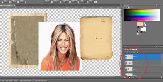 By clicking on the layers you want and then right clicking you should be able to alter them. We want to take our Grunge paper layer and make is 50% transparent. 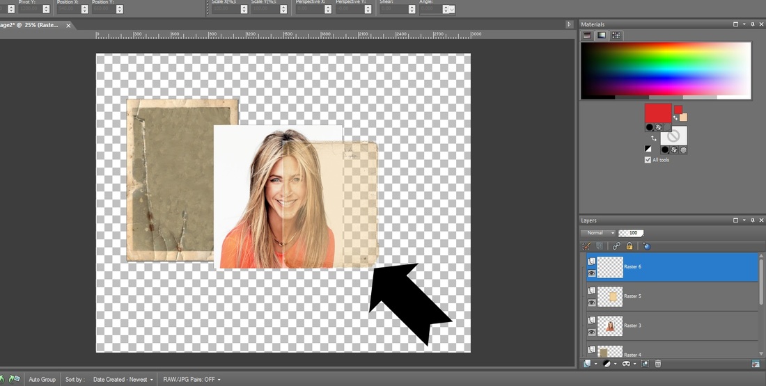 You can see that by pushing the now 50% transparent layer over the top of Jenn's photo she already is starting to look vintage. WOOT! Now you will do just that. Take that transparent layer and move it completely over the photo. Now usually I would never adjust an image from the sides but in this case since we want the grunge paper to give our photo that look we don't have to worry about stretching it out of shape. So go ahead and do just that. Grabbing from the corners and sides adjust that image over the top of your photo until the corners match up. It should now look something like this: 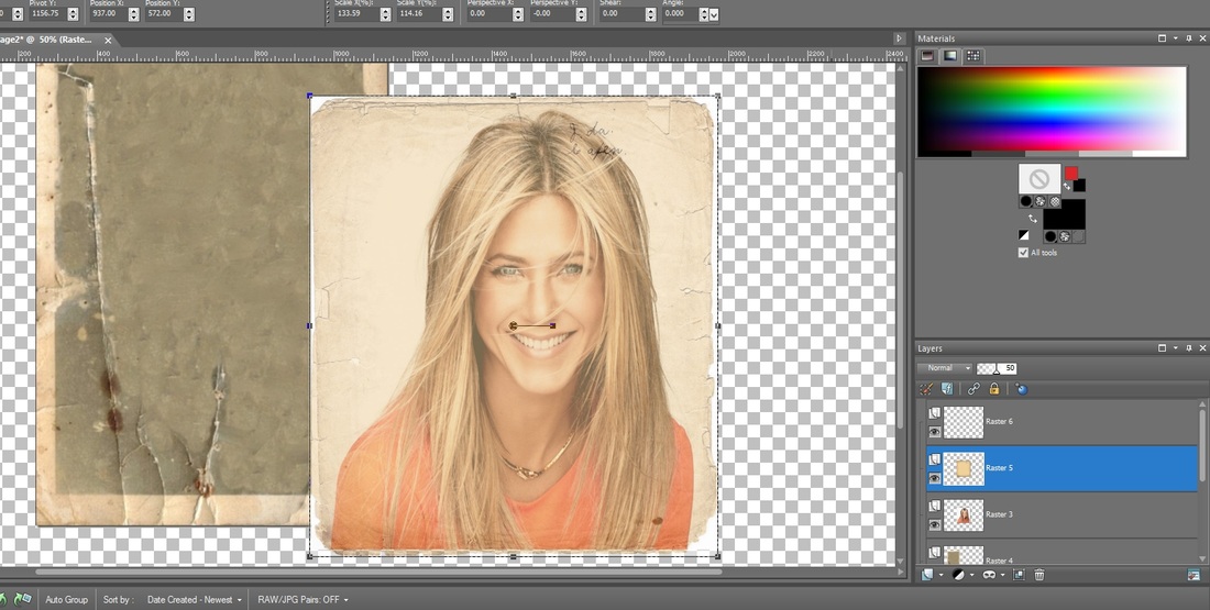 At this point you can leave it like it is or if you want it to look more vintage you will need to adjust your actual photo to a black and white image. I am going to go ahead and do that and then I will merge these 2 layers together by right clicking on the grunge layer and merging it down on top of Jen's now black and white photo. Be careful not to merge the wrong layers, you can move them up and down by dragging them in the layer panel. Then I will take my eraser tool and start erasing the white edges that are showing down to the grunge edge. Yes there are better ways to do this but this is a simple tutorial. Here is the black and white merged with the grunge and the eraser tool showing: 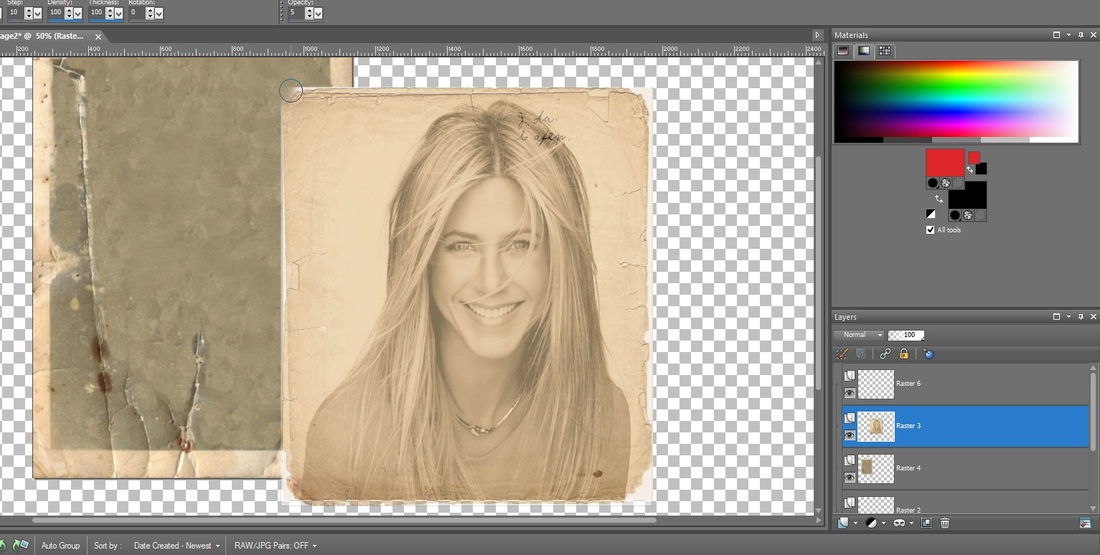 Looking very vintage already yes? Ok now in my case the image I chose doesn't match up with the final Polaroid image. We can't stretch the Jenn Image from the sides because it would alter her face. We can size her properly from the corner but the Polaroid will still be a bad match up so what we do is stretch our Polaroid to fit because like the grunge layer we wont really see it in the end. I am also going to take my Jenn photo layer and make it 90% transparent. Why? Because I want to be able to see some of the cracks and stains on my final image. I will then take the eraser tool and lightly erase just a few of the grunge edges so the Polaroid will show through; this will also give it the dark vintage edge. I also did a little erasing of the Grunge layer over the cracks of the Polaroid so that you can see the tear cutting through the bottom. You can do two things now; darken the edges of the inner Polaroid with a black airbrush to darken it up further for your edges or just merge your layers now and crop your photo. I did not use the airbrush on this one BTW. And here is the final product: 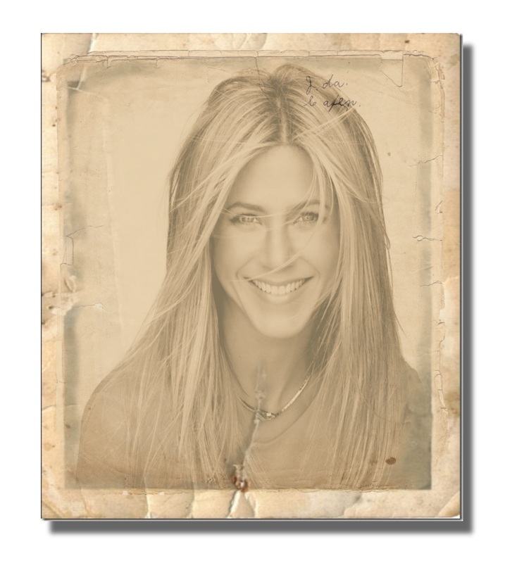 Pretty nifty huh? And done in less then a half hour with the tutorial but once you get good at it, it will take less then 15 minutes. Super fun. Now go forth; now that you understand the "Art of Vintage Photo Creation" go do your wedding photos! Make sure to upload them to our DIY page we would love to see what you did! Have a great time!   So you lost, left, don't have a job. You are considering going freelance. First let me say if you are trying to be my competition choose another venue...HA! Kidding but freelance definitely has its ups and downs. Including the fact there is so much competition out there. I love the competition. It gives me an opportunity to fine tune my skills learning from those who may be better and assisting those who want to learn. There is always a lot of work out there to be had and done. Just do your best and remember customer experience is ALWAYS the most important. Today I am assisting you in your endeavors to strike out on your own with a free E-book that is available for just seven days. Be sure to go get your copy ASAP. This E-book is the first in a series that is geared towards becoming a successful freelancer. Click on the book cover on the right to get your free copy. Here is what you will find in this book: 1. Thinking about Going Freelance? Here’s a Few Tips 2. How to Become a More Productive Freelancer 3. The Daily Schedule for Freelancing Success 4. The Successful Freelance Web Worker: Increase Productivity and Reduce Stress 5. How to Make Your Freelance Business Stand Out If you wish to discuss this book with me check the bottom left to see if I am on for live chat. I would be more than happy to assist you. Best of luck and tune in often for tips! 
Have a great weekend. What will you be doing? TONKS where are you?   For those of you who don't know much about what I do. I do lots of things! One of the things I do is create a lot of banners/headers for blogs and web sites, twitter facebook, Etsy. Banners usually go to the top of your page which is why it is called a "Header". Today I was working on the above banner for a customer. His previous banner which I will post below needed some help and he hired me to fix it. His instructions were that he wanted it to look dark misty/ghostly, have his title and the caption about sending in your photos. He said he had no set image in his mind. GREAT! Those are my favorite kind. I love when I get the freedom to do a banner using my own ideas. Direction is great and needed because I don't do free marketing developing a banner. So with his idea of it being "dark and misty" I decided it would be really cool to focus on a energy wisp that is commonly seen in ghost photos. Sometimes they are blue, white or red. I went with the blue and decided to have the ball leave a trail behind it as it moves having spelled out the title in a neon appearing text. I then brought the ball around the edge from the right and into the scared girls face. The ball is just a circle made up of several other circles. Each circle contains a different color of blue. I then used a smudge tool and smudged it in a circular motion creating movement and a 3 Dimensional look. I then took a photo of a man and changed the opacity until it was nearly transparent and put it into the center of the ball. This give the appearance of a specter in the ball. There is a little more to it then that but it gives you the general gist of it. I then reflected the blue ball into the girls eyes so it appears as though she is looking at it terrified. To make the misty trail, it is made up of airbrushing a transparent white and then blue on top across the area I wanted. Then I come back in with a smudge tool and start pushing it around to give it a wispy movement. The idea is to kind of make it look sort of like cigarette smoke that curls and twists. But not too much. Again I was trying to achieve a mist not smoke. Here is what the original banner looked like. 
 |
About this page.
Life in general is an art and I will show you how to find the beauty in everything you see and do. Subscribe and receive a free weekly download and updates. Archives
May 2019
Categories
All
Are you able to donate a $1 through PayPal to help assist this artist in keeping this extensive site alive. It is all out of pocket and costs over $50 a month to finance. If you enjoy this site it would really help. Thanks in advance! |


 RSS Feed
|
|
©1996-2022 GrafXQuest LLC All Rights Reserved.
|
|